A tired fit-out shows up before your staff do. Scuffed walls, dated colours and patchy finishes quietly tell customers and tenants that the space is overdue for attention. The right commercial painting ideas do more than freshen a building up – they help shape how people feel in it, how easy it is to maintain, and how well it reflects your business.
For most commercial properties, the best result comes from balancing appearance with practicality. A showroom has different demands from a medical suite. A busy office needs a different finish from a retail tenancy. Good painting decisions are not only about picking a nice colour. They are about wear, lighting, traffic, branding and how the space is used every day.
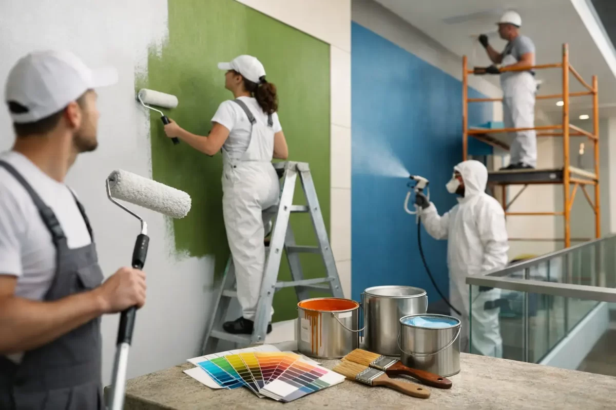
Commercial painting ideas that improve the whole space
Some commercial interiors only need a cleaner, more current palette. Others benefit from a more deliberate update that supports customer experience, staff comfort or easier upkeep. These ideas work best when they are matched to the function of the building rather than copied from a trend.
1. Use a neutral base and add colour with purpose
A neutral base is often the safest starting point for commercial interiors because it keeps the space bright, clean and flexible. Soft whites, warm greys and light greiges tend to work well across offices, reception areas and multi-use spaces. They also make signage, furniture and branding elements easier to update later.
That does not mean the whole space has to feel plain. One or two well-placed feature colours can create structure without overwhelming the room. A reception wall, meeting room end wall or client-facing zone can carry a stronger tone that reflects the business identity. The key is restraint. Too many feature colours can make a commercial fit-out feel disjointed.
2. Choose low-sheen and washable finishes for high-traffic walls
In commercial settings, finish matters almost as much as colour. Corridors, waiting rooms, stairwells and shared amenities cop constant contact. Flat paint may look good on day one, but in hard-working areas it can mark too easily and be harder to clean.
Low-sheen or washable interior finishes usually offer a better balance. They help hide minor wall imperfections while standing up better to day-to-day cleaning. In some environments, a slightly tougher finish is the more cost-effective choice, even if it is not the cheapest option upfront. Less repainting and easier maintenance often save money over time.
3. Break up large walls with subtle tonal contrast
Big open-plan spaces can feel cold if every wall is painted the same bright white. One of the more effective commercial painting ideas is to use tonal variation instead of sharp contrast. That might mean keeping the main walls light while using a slightly deeper shade on bulkheads, columns or internal partitions.
This creates depth without making the space feel smaller. It can also help define zones in larger offices or customer areas. In workplaces where concentration matters, subtle contrast usually performs better than dramatic colour blocking.
4. Paint ceilings strategically, not automatically white
Ceilings are often ignored, yet they have a real effect on how spacious or polished a room feels. White remains a strong option in many commercial interiors because it reflects light and helps the room feel open. But there are cases where a different approach works better.
In spaces with exposed services, darker ceiling colours can reduce visual clutter and give the fit-out a more refined look. In hospitality or boutique retail, a softer ceiling tone can make the room feel more considered and less clinical. It depends on ceiling height, lighting and the mood you want to create. What works in a trendy café will not always suit a professional office.
Commercial painting ideas for different business types
The best paint scheme is usually the one that supports the way the business actually operates. That sounds obvious, but it is often missed when decisions are driven only by trends or personal taste.
Offices and professional suites
For offices, calm and consistency usually matter more than bold design statements. Light neutrals, muted greens, soft greys and warm whites can help create a professional atmosphere without feeling sterile. Meeting rooms may benefit from slightly deeper tones to make them feel more grounded, while open workspaces generally suit lighter shades that reflect natural light.
If staff spend long hours in the space, avoid colours that feel too harsh under artificial lighting. Bright whites can sometimes read cold, especially in older buildings. Testing colours on site is worth the effort because the same paint can look very different from one tenancy to the next.
Retail spaces and showrooms
Retail painting needs to support the product, not compete with it. If the stock is colourful or visually busy, quieter wall colours often work best. If the product range is minimal or high-end, stronger wall colours may help create atmosphere and brand distinction.
Entry points and counter areas deserve particular attention because they carry the first impression. Durable finishes are also important in retail, where trolleys, stock movement and foot traffic can quickly wear down soft coatings.
Medical, wellness and service businesses
Clean does not have to mean cold. Medical and wellness spaces usually benefit from soft, reassuring colours rather than stark whites everywhere. Gentle neutrals, muted blues, greens and warm off-whites can help the space feel calm and well cared for.
In these environments, a smooth, professional finish matters a great deal. Clients notice patchiness, uneven repairs and poor cut-in lines more than many business owners realise. A clean finish builds confidence before a service even begins.
Exterior commercial painting ideas that add value
Exterior presentation matters because it starts working before anyone steps inside. For shops, offices, strata buildings and warehouses, external painting affects both appearance and maintenance.
5. Refresh the façade with a modern, durable palette
A dated exterior can often be improved with a simpler palette rather than a more complex one. Charcoal, crisp white, soft grey and muted earthy tones tend to suit many commercial buildings and age well. These combinations can sharpen up older brick, render or cladding without making the property look overdesigned.
On the Gold Coast and in Tweed, sun exposure, humidity and salt in some areas also need to be considered. Exterior products and colour choices should be selected with local conditions in mind. Dark colours can look striking, but on some surfaces they may show wear faster or absorb more heat. That does not rule them out, but it does mean the substrate and location matter.
6. Use trim and feature sections to create definition
You do not need a full colour overhaul to improve the outside of a building. Sometimes repainting trims, entry surrounds, balustrades or feature panels is enough to make the whole property feel sharper. This is a practical option for owners who want impact without the cost of a full redesign.
Done well, contrast on trims and architectural details can also help signage stand out more clearly. The finish still needs to be durable and properly prepared, especially on weathered exteriors where peeling or chalking paint may already be an issue.
Ideas that look good and reduce maintenance
A commercial paint job should not only look right at handover. It should still perform after regular use, cleaning and exposure.
7. Prioritise prep where walls have taken a beating
Repainting over dents, flaking areas or poor previous repairs rarely gives a professional finish. In commercial work, preparation often makes the difference between a paint job that lasts and one that quickly looks tired again. Filling, sanding, patch repair and surface stabilisation are not glamorous parts of the job, but they are where value is built.
This is especially relevant in older offices, retail tenancies and renovation projects where walls may have seen years of fixtures, signage changes or tenant wear. If the substrate is not right, even premium paint will struggle to hide it.
8. Match the paint system to the area
Different parts of the same property may need different products. Internal plasterboard walls, exterior render, timber trim, metal doors and high-contact joinery all behave differently. One paint system across everything is not always the smart choice.
A practical commercial approach looks at durability, appearance and maintenance requirements together. In some areas, a simple repaint is enough. In others, specialty primers or tougher coatings are worth using because they extend the life of the work.
9. Consider staged painting to minimise disruption
For occupied commercial spaces, the best idea may be more about planning than colour. Staging the work after hours, across zones or in quieter periods can reduce disruption to staff and customers. That matters just as much as the finish itself.
A dependable contractor will help plan around operations, protect the site properly and keep communication clear throughout the project. For many business owners, that reliability is what turns a stressful maintenance job into a straightforward one.
What separates a smart commercial repaint from a rushed one
The strongest commercial painting ideas are usually the ones that still make sense six months later. Trendy colours can date quickly. Cheap products can mark or fail early. Rushed prep tends to show up once the light hits the wall or the building starts to wear.
A better approach is to look at the property as a working environment. How much traffic does it get? What impression should it create? How often can it realistically be maintained? Those questions usually lead to better choices than chasing whatever is popular at the time.
That is also why colour guidance can be valuable. Business owners often know what they dislike, but not always what will work best across lighting conditions, wall surfaces and existing finishes. An experienced painting team can help narrow that down into a scheme that suits both the property and the purpose.
If your commercial space is starting to look tired, the right repaint can do more than improve the walls. It can make the whole property feel better run, better cared for and more ready for the people who use it every day.

