

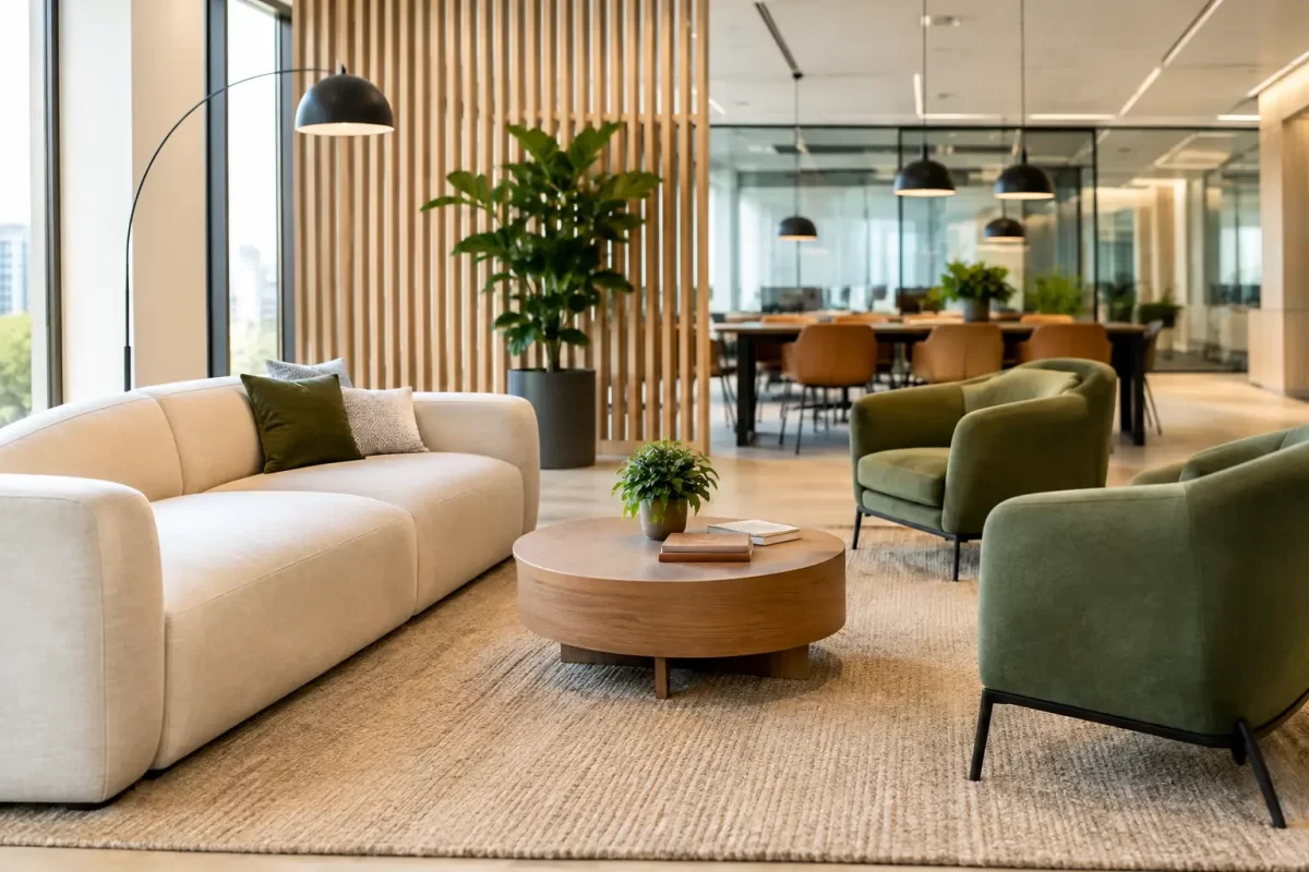
A commercial space has to do more than look current. It needs to support staff, welcome customers, stand up to daily wear and reflect the standard of the business behind it. The most worthwhile commercial interior design trends are not about chasing a short-lived look. They are about making practical choices with colour, texture, layout and finishes that continue to perform long after the work is complete.
For business owners, landlords and renovators, the best result comes from balancing visual impact with maintenance, lighting, foot traffic and the way people actually use the space. Paint and surface preparation play a major role in that balance. A well-chosen colour is only as good as the finish beneath it.
Commercial Interior Design Trends Moving Beyond Plain White
White walls still have a place in commercial interiors, particularly where a business needs a bright, clean and flexible backdrop. But all-white spaces can feel flat, clinical or quickly marked in busy environments. Many businesses are now using warmer neutrals to create a more comfortable first impression without making the space feel dark.
Soft stone, warm grey, putty, sand and muted clay tones are increasingly popular across offices, retail stores, hospitality venues and professional service spaces. These colours work well with timber, black hardware, natural fabrics and indoor greenery. They also tend to hide minor scuffs better than a stark white wall, which can make ongoing maintenance easier.
The right neutral depends on the available light. A colour that appears calm in a bright showroom can look dull or heavy in a south-facing office or internal corridor. Before committing, consider the amount of natural light, existing flooring, joinery and artificial lighting. Sampling colours on the actual walls is a sensible step, especially where the finish covers a large area.
Deep colours are being used with more purpose
Dark green, charcoal, deep blue and rich terracotta are appearing in reception areas, meeting rooms, dining spaces and feature walls. Used carefully, these shades can give a business a more established and confident feel. They can also create useful visual zoning in an open-plan space.
The trade-off is that deep colours show uneven preparation and application far more readily than lighter shades. They may also need more frequent touch-ups where chairs, bags or customer traffic come into contact with the wall. Proper plastering, sanding, priming and a durable paint system are essential if a darker colour is going to look sharp over time.
Flexible Spaces Need Clear Visual Zones
Commercial layouts are changing because spaces are being asked to do more. An office may need areas for focused work, quick meetings, private calls and informal collaboration. A retail store may require room for displays, consultations and online order collection. In hospitality, customers often expect different seating options within the same venue.
Rather than relying solely on partitions, many fit-outs use colour and finish changes to define these areas. A feature colour behind a reception desk, a darker tone in a meeting nook or a change in sheen level can help people understand how a space is intended to be used.
This approach can be cost-effective, but it needs restraint. Too many competing wall colours can make a workplace feel busy and disjointed. A simple palette of two or three related tones usually provides enough distinction while keeping the overall interior professional.
Paint can also help direct movement through a space. A carefully placed colour block can lead visitors from an entry to reception, highlight a service counter or make a long hallway feel less blank. For public-facing businesses, this is useful design that does not rely on expensive structural changes.
Texture Is Replacing Flat, Featureless Finishes
Texture is becoming a stronger part of commercial interiors, particularly in businesses that want warmth and character without excessive decoration. This may include textured plaster finishes, timber detailing, decorative wall panelling, tactile fabrics or subtle paint effects.
In the right setting, texture adds depth and helps soften spaces with hard surfaces such as tile, glass and polished concrete. It is often a good fit for cafés, wellness spaces, boutiques and reception areas where atmosphere influences how customers feel.
Not every wall needs a decorative finish. High-touch areas, corridors and service zones generally benefit from smoother, washable surfaces that are easier to clean and repair. A practical approach is to reserve textured or specialist finishes for focal walls, then use hard-wearing low-sheen paint on the surrounding areas.
Surface preparation matters particularly with texture. Existing cracks, dents, peeling paint and uneven plaster will affect the final result. Addressing those issues before painting prevents a new finish from drawing attention to old problems.
Better Acoustics Are Part of Good Design
Noise has a direct effect on how a commercial space feels. Hard surfaces can make a busy office echo, make a restaurant feel tiring or reduce privacy in a consulting room. As a result, acoustic considerations are becoming part of interior design discussions much earlier in a project.
Paint will not solve an acoustic issue on its own, but colour and finish choices should work alongside acoustic panels, ceiling treatments, carpets, curtains and soft furnishings. Muted palettes and softer finishes can visually support a calmer environment, while a bold acoustic feature wall can become a design element rather than something to hide.
For offices and client-facing rooms, privacy is also worth considering. A space may look polished but still fail its users if conversations carry across the room. Planning the finish, furniture and acoustic treatment together leads to a better everyday outcome.
Commercial Interior Design Trends Favour Durability
A finish that looks excellent on handover day but marks easily is rarely good value. One of the most practical shifts in commercial interior design is the focus on materials that are easier to maintain, repair and keep presentable.
Low-sheen and washable paint finishes remain a reliable choice for many commercial walls. They reduce glare, offer a refined appearance and are generally more forgiving than high-gloss finishes. In high-traffic settings, a quality coating system can make cleaning simpler and reduce the need for frequent repainting.
The best paint finish depends on the room. A staff kitchen, medical-style consulting area or busy retail corridor may require higher washability than a boardroom. Skirting boards, doors and trims also need a tougher finish than broad wall areas because they receive more knocks and scuffs.
It is worth considering future maintenance before choosing a colour. Very pale walls can show dirt, while very dark walls can reveal scratches and dust. Mid-tone neutrals are often a sensible middle ground for areas with regular public or staff traffic. Keeping a record of the final paint colours and products also makes later touch-ups much easier.
Biophilic Details Continue to Shape Commercial Spaces
Businesses are still bringing natural elements into interiors through plants, timber, natural fibres and earthy colour palettes. This trend is often called biophilic design, but the idea is straightforward: spaces feel more inviting when they include a connection to nature.
For commercial interiors, paint colours are an easy way to support this look. Olive, eucalyptus, soft blue-grey, warm beige and clay tones can complement planting and timber without turning the workplace into a themed space. The key is to choose colours that suit the brand as well as the building.
A law office, gym, salon and café will not need the same palette, even if all want a calmer, more natural feel. The most successful interiors use trends as a starting point, then make decisions that suit their customers, staff and day-to-day operations.
Plan the Finish Around the Business, Not the Mood Board
Online inspiration is useful, but it rarely shows the condition of existing walls, the strength of site lighting or the effect of constant use. Before selecting colours and finishes, assess what the space needs to achieve. Is it meant to feel more premium, more welcoming, more focused or easier to navigate? Does it need to cope with wet areas, frequent cleaning or heavy movement of stock and equipment?
A professional painting team can help identify preparation work, recommend suitable finishes and apply colours with clean lines and consistent coverage. This is particularly valuable in operating businesses, where work needs to be organised carefully to minimise disruption and keep the site tidy.
For Gold Coast and Tweed businesses preparing a new fit-out or a commercial refresh, Jag Painting Solutions can provide practical guidance on colour, plastering and long-lasting interior finishes. A considered paint system is not just a final touch. It helps your space look cared for, work harder and give customers confidence from the moment they walk through the door.


