Categories
Uncategorized

Best Office Paint Colours for Productive Spaces

A fresh office fit-out can look excellent on paper, then feel flat or distracting once the paint is on the walls. The best office paint colours need to do more than match a logo or look good in a sample pot. They should support the way people work, suit the available light and give clients confidence from the moment they walk through reception.

For Gold Coast and Tweed businesses, colour selection also needs to account for strong natural light, heat and the practical demands of a busy workplace. A considered paint scheme can make a compact office feel more open, bring calm to high-pressure areas and help a commercial space look well maintained for longer.

Start with how each part of the office is used

There is no single best colour for every office. A quiet accounting practice, a creative studio, a medical reception and a warehouse administration area all have different needs. Before choosing a palette, consider what happens in each space, who uses it and how long they spend there.

Reception areas need to feel welcoming and professional. Open-plan workspaces benefit from colours that reduce visual fatigue rather than compete for attention. Meeting rooms can carry a little more personality, while private offices may suit warmer tones that make conversations feel less formal.

It also pays to look beyond the walls. Existing flooring, desks, joinery, window furnishings and signage all affect how a paint colour will read. Choosing a colour in isolation is one of the quickest ways to end up with a finish that feels slightly off.

Best office paint colours for different work zones

Warm whites for flexible, professional interiors

Warm white remains a dependable choice for offices because it is clean without feeling clinical. It works particularly well in reception spaces, corridors and workplaces with timber furniture, charcoal carpet tiles or black aluminium framing.

Avoid choosing a bright, stark white simply because it seems safe. In a sunlit Gold Coast office, very cool white can create glare and make the room feel harsh. A soft white with a subtle cream, beige or grey undertone usually gives a more comfortable result while still reflecting plenty of light.

Warm whites are also a practical base for businesses that update their furniture, graphics or branding over time. They allow feature colours to change without requiring a full repaint.

Soft greys for a modern, balanced look

Soft grey is a useful neutral when white feels too plain. Pale greys can make an office look polished and contemporary, especially alongside light timber, glass partitions and matte black details. They are well suited to boardrooms, professional service offices and commercial tenancy refreshes.

The trade-off is undertone. Some greys lean blue or purple and can feel cold under fluorescent lighting or on overcast days. Others have a warmer, greige base and are generally easier to live with. Testing large sample patches on different walls is essential, as the same grey can change noticeably between morning and afternoon light.

Muted greens for calm and concentration

Sage, eucalyptus and soft olive tones are increasingly popular in offices for good reason. These colours bring a calm, grounded feel without becoming dull, and they sit naturally beside timber, plants and neutral furnishings.

Muted green works well as a feature wall in a meeting room, a breakout zone or behind a reception desk. In smaller offices, use it selectively rather than painting every wall. A full room of dark green may feel refined in a large, well-lit space, but can make a compact room feel enclosed.

For businesses wanting a more relaxed and approachable feel, green is often a better long-term option than brighter trend colours. It has character, but it does not usually dominate the room.

Blue tones for focus and trust

Blue has a strong association with clarity, trust and professionalism, making it a natural fit for many workplaces. Soft blue-greys can suit consulting rooms and focused work areas, while deeper navy can create a confident backdrop in a boardroom or reception area.

Use darker blues with care. They can look sharp against white trims and quality joinery, but they need good lighting and a clean surface finish. Dark paint also shows scuffs, patchy touch-ups and poor preparation more readily than lighter colours. In high-traffic zones, selecting the right sheen level and applying it properly makes a real difference to how the wall wears.

Earthy neutrals for welcoming client spaces

Light sand, mushroom, clay and taupe shades can make a client-facing office feel more comfortable and established. They work especially well for property, wellness, legal and service businesses where the aim is to put visitors at ease.

These tones are not as stark as white and generally hide minor marks better than very pale finishes. The key is keeping them light enough to retain brightness. Deep brown or heavily yellow beige can date an office quickly, particularly when paired with older fluorescent lighting.

Charcoal and black for controlled contrast

Dark charcoal or black can give an office a premium, contemporary edge, but it is rarely the best choice for every wall. It is more effective on a single feature wall, internal framing, a reception backdrop or selected joinery.

Strong contrast can help define a space and reinforce brand presence. However, it may also reduce light levels and make a small office feel smaller. If the room has limited windows, balance dark paint with lighter surrounding walls, suitable artificial lighting and reflective finishes where appropriate.

Consider light before committing to a colour

Natural light changes paint more than most people expect. North-facing windows often bring warmer, stronger light, while south-facing rooms can make colours appear cooler and more subdued. Artificial lighting matters just as much, particularly in offices that operate early, late or away from windows.

Paint small sections of wall, not just a sample card, and view them at several times of day. Place samples near desks, doors, windows and existing furnishings. This gives a far more accurate picture of how the colour will perform once the office is in use.

Sheen should be chosen at the same time. Low-sheen finishes are popular for office walls because they give a refined look and reduce obvious glare. They still need sound plastering and preparation underneath, as any dents, joins or uneven surfaces can show through once light hits the wall. In corridors, kitchens and other high-contact areas, a more washable finish may be worth considering for easier maintenance.

Make branding part of the scheme, not the whole scheme

Many businesses feel pressure to paint large areas in their brand colours. This can work when the brand palette is neutral or restrained, but bright corporate colours often become tiring when used wall to wall.

A better approach is usually to build the office around a calm base palette, then bring brand colours into a feature wall, signage zone, meeting room detail or selected painted elements. This keeps the workplace professional and helps the brand stand out without overwhelming staff and visitors.

If your business is leasing a commercial space, a balanced scheme can also make future changes easier. Neutral main walls have broad appeal and may reduce the work required when a tenancy changes hands.

Preparation matters as much as the colour

Even the right colour will not look professional over damaged plaster, poorly repaired holes or uneven previous coatings. Commercial interiors often have more wall wear than expected, particularly around desks, corridors, light switches and reception counters.

Proper preparation may include patching, sanding, sealing stained areas and repairing plasterboard before the first coat goes on. This is where experienced painters add value. A smooth, consistent finish helps colours look true, wears better in daily use and gives the whole workplace a more considered appearance.

For a business, timing is equally important. A planned painting project can often be staged around operating hours, staff access and furniture movement to reduce disruption. Clear communication about preparation, drying times and access requirements helps keep the job straightforward.

Choosing colours with confidence

The best office paint colours are usually the ones that make work easier without drawing attention to themselves every day. Warm whites and soft greys provide a reliable foundation. Muted greens, calm blues and earthy neutrals add personality where it suits the space, while deeper colours work best as deliberate accents.

A professional colour consultation can help narrow the choices before work begins, particularly where natural light, existing finishes or brand colours complicate the decision. Jag Painting Solutions works with business owners to select practical colours and deliver a high-quality finish that respects the workplace.

Choose a scheme that reflects your business, supports the people using the space and will still feel right after the novelty of a new paint colour has passed.

Categories
Uncategorized

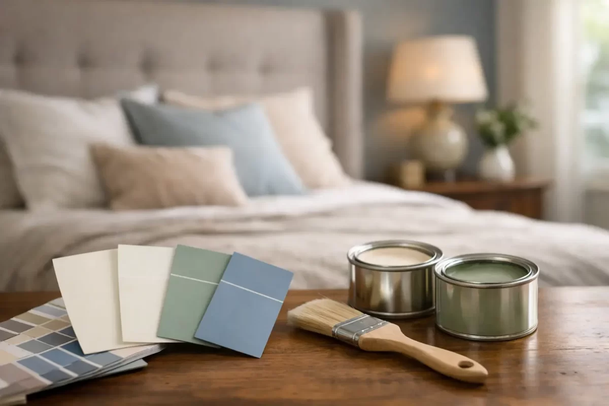
Best Paint Colours for Bedrooms That Feel Right

A paint sample can look soft and inviting in the shop, then feel completely different once it is on all four bedroom walls. Natural light, artificial lighting, flooring, linen and the size of the room all influence the result. That is why choosing the best paint colours for bedrooms is less about following a trend and more about creating a space that feels comfortable at the beginning and end of every day.

A bedroom does not need to be plain to be restful. It simply needs a colour that works with the room itself and the way you want to use it. Whether you are updating one room or preparing a whole home renovation, taking a little time to test colours properly can prevent an expensive change of mind later.

Start with the feeling you want from the room

Before looking at paint cards, consider how you want the bedroom to feel. Most people want a calm, private space, but calm can mean different things. For some, it is a light warm neutral with natural textures. For others, it is a deep green or blue that makes the room feel quieter and more enclosed.

Soft whites, warm greiges, muted greens, dusty blues and gentle pink-based neutrals are reliable choices because they are easy to live with. They also give you flexibility if you change bedding, curtains or furniture over time. A well-chosen neutral should not feel cold or unfinished. It should give the room a settled background and let the furnishings do their job.

If you prefer more colour, choose a toned-down version rather than the brightest option on the card. A muted sage generally feels more restful than a vivid leaf green. A smoky blue is often easier to live with than a strong cobalt. Bedrooms are used in low light as much as daylight, so colours with a little grey, brown or earthy warmth usually sit more comfortably across the day.

Best paint colours for bedrooms by mood

Warm whites and soft neutrals

Warm white remains a practical choice for bedrooms, particularly in homes with timber furniture, beige carpet, stone finishes or layered neutral linen. Look for whites with a soft cream, beige or grey undertone rather than a sharp, stark white. A pure cool white can make a south-facing room feel flat and chilly.

Greige, putty, mushroom and pale taupe are excellent alternatives when white feels too bare. These shades add depth without making a room noticeably dark. They are also a sensible option for resale, rental properties and renovation projects where you want a polished result that appeals to a wide range of tastes.

The trade-off is that subtle neutrals can appear quite different beside existing finishes. A greige with a pink undertone may clash with yellow-toned timber, while a cooler grey can look blue against creamy tiles. Always view samples against the surfaces that are staying in the room.

Soft greens for a grounded feel

Sage, eucalyptus, olive-grey and softened khaki tones work beautifully in bedrooms because they bring in a connection to nature without demanding attention. They pair well with timber, rattan, warm white trims and off-white bedding.

On the Gold Coast, where bright daylight can make pale colours look lighter than expected, a mid-tone muted green can be a good choice. It holds its character in sunny rooms and still feels relaxed at night. In a darker bedroom, however, choose a lighter sage or use the deeper colour on a feature wall only.

Blues that help a room feel calm

Blue is a popular bedroom colour for good reason. Soft blue-grey, misty blue and muted denim shades can make a room feel cooler and more settled, especially in rooms that receive strong afternoon sun. They also work well in coastal homes without turning the space into a themed beach room.

Very pale blue can read almost white in bright light and may feel cold when paired with cool grey flooring. Balance it with warm timber, natural fabrics or warmer white trims. Deeper navy and ink blue can create a smart, cocooning look, but they suit rooms with reasonable natural light or thoughtful layered lighting. In a small, poorly lit room, they can feel heavy if used wall to wall.

Blush, clay and gentle earthy tones

Muted blush, pale terracotta, soft apricot and clay-based neutrals can make a bedroom feel warm and personal. These colours are particularly effective where the home has warm flooring, aged brass details or earthy textiles. They can be more forgiving than cool grey when the room has limited natural light.

The key is restraint. Choose a softened, dusty shade rather than a bright pink or orange if you want a finish that will still feel right in a few years. Earthy tones are often best supported by clean, warm white ceilings and trims so the room retains a sense of lightness.

Deep colours for a more cocooned bedroom

Deep charcoal, forest green, navy, plum and chocolate brown can all work in a bedroom when used with confidence. Dark walls can blur the edges of a room, making the space feel intimate rather than smaller. They are particularly effective in larger bedrooms, rooms with high ceilings or spaces where the aim is a hotel-like atmosphere.

A darker scheme needs more consideration than a light neutral. Ceiling colour, window coverings, bedside lighting and sheen level become more noticeable. If you are unsure, paint the wall behind the bed in the deeper shade and keep the remaining walls lighter. This creates focus without committing the whole room to a dark finish.

Check the light before making a final choice

Light is often the deciding factor between a colour that looks right and one that disappoints. North-facing bedrooms usually receive warmer light and can handle cooler colours well. South-facing rooms receive less direct light, so warmer whites and softer earthy tones often prevent them from feeling dull.

East-facing rooms are bright in the morning and cooler later in the day. West-facing rooms can become very warm in the afternoon, where blue-grey, soft green and balanced neutrals can provide relief. These are guides, not rules. The surrounding trees, neighbouring buildings, window size and existing finishes will change the result.

Paint sample boards are more useful than small swatches. Apply two coats to a large board, then move it around the room and check it in morning, afternoon and evening light. Hold it beside the flooring, wardrobe, bedhead and curtains. This extra step is one of the simplest ways to make a confident colour decision.

Do not overlook ceilings, trims and finish

Walls are only one part of the finished bedroom. A crisp white ceiling can lift a room, while a ceiling painted in the same colour as the walls can create a softer, more enveloping feel. In smaller bedrooms, keeping the ceiling light is usually the safer option. In larger rooms, a full-colour treatment can be striking when the shade is muted or dark.

For trims, a warm white generally works well with warm neutrals, green and earthy shades. A cooler white may better suit blue-grey walls. The difference can be subtle, but mismatched undertones are often what makes a finished room feel slightly off.

Most bedroom walls suit a low-sheen or washable matte finish. Matte finishes reduce glare and help conceal minor surface imperfections, giving the room a calm appearance. Low sheen offers a little more durability and is a practical choice for children’s rooms or high-use spaces. The preparation underneath matters just as much as the paint itself. Clean repairs, smooth sanding and careful cutting-in are what give a painted room its professional finish.

A practical approach to choosing your colour

Begin with the elements you are not changing, such as carpet, flooring, built-in wardrobes or a favourite bedhead. Then narrow your choices to two or three colours that work with those finishes. It is easier to select paint around fixed items than to repaint because a colour clashes with them later.

Think about the bedroom as part of the wider home as well. Each room does not need to be identical, but colours should feel connected as you move through the house. A warm neutral main bedroom, soft green guest room and muted blue children’s room can work together when they share a similar depth and undertone.

For homeowners who would rather not make the call alone, professional colour guidance can save time and avoid costly repainting. Jag Painting Solutions works with clients to consider lighting, existing finishes and the overall look they want before painting begins. The right colour choice, paired with careful preparation and skilled application, makes the bedroom feel like it belongs in the home from day one.

Take samples home, live with them for a few days and trust the colour that still feels comfortable in the evening. That is often the one you will be happiest waking up to.

Categories
Uncategorized

Colour Consultant Gold Coast Homeowners Can Trust

A colour that looked perfect on a small sample card can feel completely different once it covers a sunlit living room, a shaded exterior wall or an entire office. Working with a colour consultant Gold Coast property owners can rely on helps remove that uncertainty before the brushes come out. It is a practical step that can save time, prevent costly repainting and make sure the finished space feels right from every angle.

Choosing paint is not simply a matter of picking a favourite shade. The amount of natural light, the direction a room faces, existing flooring, fixed finishes and the age of the property all influence the result. For exterior projects, local weather exposure and the surrounding streetscape also deserve consideration.

Why colour choices deserve more thought

Paint is one of the most visible parts of a renovation or property refresh, yet it is often chosen late in the process. A rushed decision can leave a room looking darker, colder or busier than intended. It can also make quality plastering and careful paint application harder to appreciate.

The right palette brings the different parts of a property together. It can make a compact room feel more open, give a dated exterior a cleaner appearance or create a professional setting for staff and customers. Just as importantly, it should suit how the space is used every day.

For homeowners, that might mean selecting a durable, forgiving finish for a busy hallway while creating a calmer feel in bedrooms. For a business owner, it may mean colours that reflect the brand without overwhelming the space. There is no single best white, grey or neutral. The right choice depends on the property, the light and the intended result.

What a colour consultant looks at

A professional consultation starts with the space, not a pre-set palette. Looking at colour in context is the difference between an idea that works online and a finish that works on your walls.

Natural and artificial light

Gold Coast homes often have strong daylight, wide openings and outdoor areas that influence interior colour. A warm white can appear creamy in one room and quite crisp in another. Cooler tones may feel fresh in bright areas but can turn dull in a south-facing room with limited daylight.

Light changes during the day as well. A colour worth considering should be viewed in the morning, afternoon and evening, not judged under one set of conditions. Existing downlights, pendants and exterior lighting also affect how a painted surface reads after sunset.

Fixed materials and surrounding finishes

Floors, tiles, benchtops, cabinetry, roofing, stonework and window frames are expensive to replace, so they should guide the colour scheme rather than be ignored. A paint colour with the wrong undertone can clash with timber flooring or make a neutral tile look unexpectedly pink, green or yellow.

A consultant helps identify these undertones and build a palette around them. This is especially useful in renovations where old and new materials need to sit comfortably together. The goal is not for every element to match exactly. It is to create a balanced result that feels considered.

Architecture, aspect and exterior conditions

Exterior painting needs a different approach to choosing an internal feature wall. The roof colour, brickwork, render, fences, neighbouring homes and landscaping all contribute to the final appearance. Strong coastal light can make pale colours look brighter than expected, while deep colours may show dust, salt residue or surface imperfections more readily.

Darker exteriors can look striking and modern, but they are not always the most practical option for every façade. Heat exposure, maintenance expectations and the condition of the existing surface should all be discussed before settling on a colour. Preparation and the correct coating system remain just as important as the shade itself.

A colour consultant Gold Coast projects can benefit from

A good colour consultation should feel useful, not overwhelming. Rather than handing over dozens of paint cards, the process narrows options based on your property, priorities and budget. You should come away with clear direction on the main colours, supporting tones and suitable finishes for each area.

For an interior repaint, this may include a coordinated wall, ceiling, trim and door palette. For an exterior, it can cover the façade, eaves, gutters, garage door, fencing and feature materials. Commercial projects may also need practical advice about high-traffic areas, easy-clean finishes and colour consistency across multiple rooms.

Samples still matter. Larger test patches give a far better indication than a small card, particularly with whites and complex neutrals. Paint samples should be placed on more than one wall where possible, because reflected light from gardens, fences and nearby buildings can alter the appearance.

The most useful advice is honest about trade-offs. A very pale wall colour can make a room feel airy, but may need more frequent cleaning in a family home. A strong feature colour can add personality, but may be harder to change if the property is being prepared for sale. A consultant’s role is to help you make these choices with your long-term plans in mind.

Common mistakes that lead to repainting

Many colour problems begin with choosing in isolation. A homeowner may select a wall shade before deciding on flooring, splashbacks or cabinetry, then find the finished combination does not sit well. Others select colours from photos without allowing for the difference in screen settings and natural light.

Another common issue is treating all whites as the same. White paint has undertones, and those undertones become obvious beside skirting boards, tiles and window coverings. Mixing a warm wall white with a noticeably cool trim can look accidental unless it has been planned carefully.

Finish selection is often overlooked too. Flat finishes can soften the look of a ceiling and hide minor texture, while low-sheen or washable finishes are often better suited to living areas and hallways. Higher-sheen coatings can be practical for trims and doors, but they also show preparation flaws more easily. Quality surface preparation, including plaster repairs where required, gives every finish its best chance to look clean and even.

Colour advice works best with skilled painting

A strong palette cannot compensate for poor preparation or inconsistent application. Likewise, excellent workmanship is most effective when the chosen colours and finishes suit the surface. The planning, repair and painting stages need to work together.

At Jag Painting Solutions, colour guidance is part of a wider service that considers the condition of the property and the final result you want to achieve. Whether the job involves a single room, a full home repaint, an exterior refresh or a commercial space, clear communication before work begins helps the project run smoothly.

When requesting a quote, it helps to share what you want the space to feel like, which finishes are staying and whether you are renovating, maintaining the property or preparing it for sale. Photos can be useful at the early stage, but an on-site discussion provides the clearest picture of lighting, surfaces and preparation requirements.

Make the decision before the project is underway

Colour decisions are easier when they are made before painters arrive, rather than between coats or after other trades have finished. That allows time to test samples, coordinate materials and order the right products without holding up the work.

If you feel stuck between similar shades, start with the elements you cannot change and the rooms you use most. A considered colour plan does not need to be complicated. It simply needs to suit the property, the people using it and the level of upkeep you are comfortable with. With sound advice and careful workmanship, paint becomes more than a fresh coat – it becomes a finish you will be happy to live or work with for years.

Categories
Uncategorized

Best Paints for High Traffic Walls That Last

A hallway wall can tell the real story of a home. It collects school-bag scuffs, fingerprints near light switches, marks from moving furniture and the occasional muddy hand after a wet Gold Coast afternoon. Choosing the best paints for high traffic walls is less about finding the toughest-sounding tin and more about matching the coating, sheen and surface preparation to how the room is actually used.

For busy family homes, rental properties, offices, stairwells and retail spaces, the right interior paint keeps walls looking cared for between repaints. It should clean well without leaving shiny rubbed patches, resist everyday marks and hold its colour over time. A professional finish also begins below the paint, with sound plaster repairs, clean surfaces and the correct primer where needed.

What Makes a Wall Paint Suitable for Busy Areas?

High-traffic paint needs to handle both impact and cleaning. These are related but different qualities. A wall may resist a light knock yet still show damage after repeated wiping. Another paint may wash easily but be too glossy for a wall with uneven plastering or strong natural light.

Look for interior coatings described as washable, scrubbable or stain resistant. Quality acrylic paints are generally the practical choice for most residential and commercial interiors because they dry efficiently, have low odour options available and provide a durable, flexible finish. The better products also maintain their appearance after routine cleaning, rather than becoming patchy or losing their even sheen.

The paint system matters as much as the top coat. If the wall is chalky, damaged, stained or previously painted with an unknown finish, applying a premium top coat straight over it can still lead to poor adhesion. Proper preparation gives the new coating a stable surface to hold onto.

The Best Paints for High Traffic Walls by Finish

There is no single finish that suits every busy wall. The best choice depends on the condition of the wall, the room’s lighting and how often people touch or brush past it.

Low sheen: the reliable all-rounder

Low-sheen acrylic is often the best balance for hallways, living rooms, bedrooms, dining areas and common areas in offices. It has a soft, low-reflective appearance that hides minor wall imperfections better than glossier products, while still being considerably easier to clean than flat paint.

For most homes, a premium washable low sheen is the sensible starting point. It gives a refined look without making every plaster joint, dent or roller mark more visible. In a busy corridor or family room, it usually provides enough durability for regular wipe-downs when applied correctly.

Washable matt: for a quieter look

Modern washable matt paints have improved significantly. They are useful where a very low-reflective finish is preferred, especially on large walls with strong daylight or surfaces that are not perfectly smooth. A washable matt can reduce glare and give a more contemporary appearance than traditional low sheen.

There is a trade-off. Not every matt product is equally durable, and lower-grade matt paints may burnish when cleaned. Burnishing is the change in surface appearance that leaves a slightly shinier patch after rubbing. If matt is the preferred look in a high-use space, choose a premium product specifically rated for washability rather than a basic ceiling or flat wall paint.

Satin or semi-gloss: where walls receive constant contact

Satin and semi-gloss finishes offer stronger washability and are well suited to targeted areas that receive frequent handling. Think children’s play spaces, commercial corridors, school rooms, wash areas, kitchen splash zones outside tiled sections and walls beside frequently used doors.

The higher sheen makes dirt easier to wipe away, but it reflects more light. On a wall with dents, uneven patches or old repairs, this can make imperfections stand out. Satin is often a good compromise when extra durability is needed but a noticeably glossy look is not wanted. Semi-gloss is best reserved for areas where cleaning performance takes priority over a soft wall finish.

Flat paint: use it selectively

Flat paint has a place, particularly on ceilings and in low-contact rooms where its non-reflective finish is valued. It is usually not the first choice for high-traffic walls. It can be difficult to clean without leaving marks, especially in lighter colours, and frequent touch-ups may appear different once dry.

If a flat-looking finish is essential, a premium washable matt is generally the safer option for a wall that will receive regular attention.

Match the Paint to the Room, Not Just the Colour

A good paint choice changes from one part of a property to another. A pale low sheen may work beautifully in a formal lounge but be less forgiving beside the front door, where hands, umbrellas and bags regularly pass by.

In hallways and stairwells, washable low sheen is a dependable choice. These spaces often have limited room to move furniture and are prone to rubbing at shoulder height and along corners. In homes with young children or pets, consider a tougher washable product through the entry, family room and passageways.

Kitchens need a coating that tolerates cleaning and occasional moisture, particularly around handles, bins and dining areas. Good ventilation still matters. Paint is not a substitute for a tiled splashback or suitable wet-area lining where water exposure is constant.

Commercial spaces have different pressures. Reception areas, offices, shops and medical rooms benefit from paint that can be cleaned regularly without looking tired. The right finish should also support the intended atmosphere. A glossy wall may be practical, but it may not suit a calm waiting area or a premium retail fit-out.

Colour Can Make Maintenance Easier

Colour does not make paint more durable, but it can influence how easily marks show. Crisp whites are popular and can make an interior feel clean and open, yet they reveal scuffs quickly in entries and corridors. Very dark colours can hide some marks but may show dust, rub marks and uneven touch-ups.

Mid-tone neutrals, soft greys, warm beiges, muted greens and deeper feature colours can be practical in the right location. The aim is not to choose a colour that hides neglect. It is to select a finish that remains presentable between cleans while still fitting the character of the property.

Before committing, view colour samples on the actual wall at different times of day. Gold Coast light can be bright and change the way both colour and sheen read across a room. A colour consultation can help narrow down options that work with the home’s light, flooring and existing finishes.

Preparation Is What Protects the Finish

Even the best paint cannot disguise a poorly prepared wall for long. High-traffic areas need special attention because small flaws tend to become more obvious once the wall is knocked, cleaned or viewed under angled light.

Walls should be cleaned to remove grease, hand oils, dust and residue. Loose or flaking paint must be removed, and cracks, dents and old fixings should be properly filled and sanded. Glossy existing paint may need sanding to provide a key for the new coating. Stains from water, smoke, crayons or tannin can require a stain-blocking primer so they do not migrate through fresh paint.

Fresh plasterboard repairs and bare plaster also need the appropriate sealer or primer. Skipping this stage can result in uneven suction, flashing and inconsistent sheen. Flashing is when certain patches look different from the rest of the wall, often becoming visible in sunlight or at night under downlights.

For busy walls, two full coats of a quality top coat are usually needed for consistent coverage and durability. One heavy coat is not a replacement for two properly applied coats. It can affect drying, coverage and the final appearance.

Keep High-Traffic Walls Looking Their Best

Once painted, allow the coating to cure before washing it. Paint can feel dry within hours but takes longer to reach its intended hardness. The product instructions will give a guide, and cure times can vary with temperature, humidity and ventilation.

When cleaning is needed, start gently with a soft cloth or non-abrasive sponge, warm water and mild detergent. Avoid harsh scourers and strong chemical cleaners unless the paint manufacturer confirms they are suitable. Aggressive scrubbing can damage any painted surface, including premium coatings.

Address marks early where possible. Fresh fingerprints and scuffs are generally easier to remove than old grime. Keep a small labelled amount of leftover paint for future touch-ups, but remember that touch-ups can show on older walls because of natural ageing, sun exposure and changes in sheen. On a large, visible wall, repainting from corner to corner may produce the more even result.

When Professional Advice Is Worth It

The finish choice becomes more important when walls are damaged, the building has moisture concerns, surfaces have been painted many times, or a commercial property needs a hard-wearing result with minimal disruption. These are the situations where product selection and preparation should be planned together rather than decided at the paint counter.

Jag Painting Solutions helps property owners across the Gold Coast and Tweed choose finishes that suit the room, the existing surfaces and the level of day-to-day use. Experienced tradesmen can identify what needs repairing, priming or sealing before the final coats go on, which is where a long-lasting finish is won or lost.

A wall in a busy home or workplace will always collect a few signs of life. The right paint system simply means those signs are easier to manage, and the space continues to look clean, well finished and cared for long after the brushes are packed away.

Categories
Uncategorized

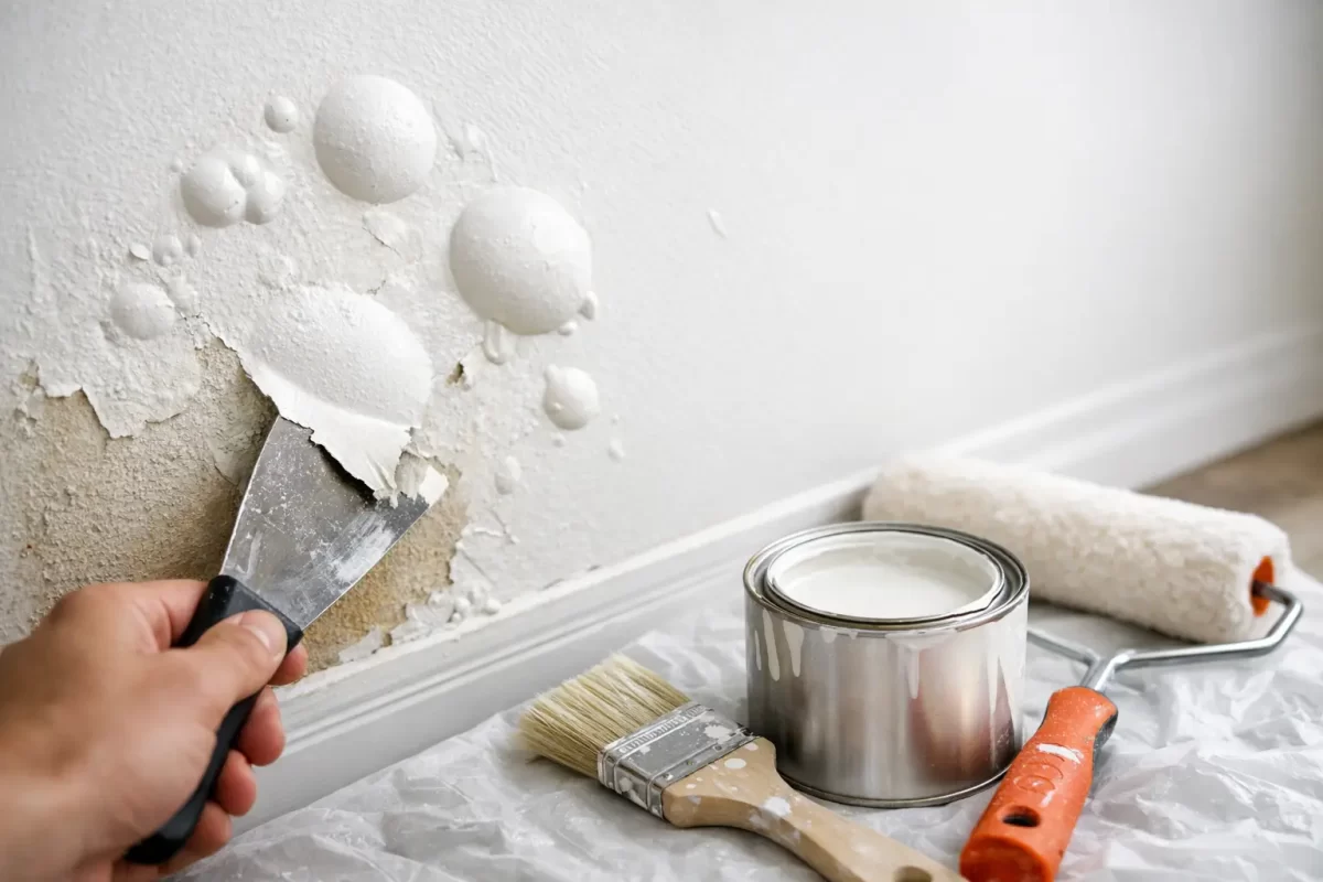
What Causes Paint to Bubble? Causes and Fixes

A wall can look perfectly finished one week and develop raised blisters the next. If you are wondering what causes paint to bubble, the short answer is that the paint has lost its grip on the surface beneath it. The more useful answer is finding out why it happened before repainting, because a fresh coat applied over the same issue will usually bubble again.

Paint bubbling can occur on interior walls, ceilings, timber trim, exterior cladding, rendered surfaces and metalwork. On the Gold Coast, humidity, driving rain and strong sun can all play a part, but the cause is not always weather. Moisture, poor preparation and unsuitable products are the usual culprits.

What causes paint to bubble on walls and ceilings?

A paint bubble, also called a blister, forms when part of the coating lifts away from the surface. Air, water vapour or liquid moisture becomes trapped beneath the paint film, creating pressure that pushes it outwards. In other cases, the paint simply cannot bond properly because the surface was dusty, greasy, chalky or coated with an incompatible product.

The position, size and timing of the bubbles offer useful clues. Bubbles that appear soon after painting are often linked to application conditions or surface preparation. Bubbling that develops months later, especially in one area, is more likely to point to a moisture problem.

Moisture behind the paint

Moisture is the most common reason paint blisters. It can come from a roof leak, leaking pipe, failed shower waterproofing, overflowing gutter, cracked external render or water entering around windows and doors. Even a small leak can affect a larger section of wall or ceiling as water travels through plasterboard, timber framing or masonry.

Bathrooms, laundries and kitchens are particularly vulnerable because of steam and condensation. A poorly ventilated bathroom may not have a plumbing leak at all. Repeated hot showers can leave moisture sitting on cold ceiling and wall surfaces, gradually weakening the paint system.

On exterior surfaces, rainwater can enter through unsealed gaps, deteriorated caulking, cracked paint or damaged flashing. The paint is then blamed for a building-maintenance issue it cannot solve on its own. Repainting before the source of water is repaired only hides the problem temporarily.

Painting over a damp surface

A surface can feel dry to the touch while still holding too much moisture for painting. Fresh plaster, patched areas, masonry and timber all need adequate drying time. After heavy rain or a water leak, this can take longer than expected, particularly in humid conditions.

When paint is applied too soon, moisture tries to escape as the coating dries. It can become trapped under the paint film and form bubbles. This is why experienced painters allow for drying conditions rather than relying only on the clock.

Poor cleaning and surface preparation

Paint needs a clean, sound surface to adhere properly. Dust from sanding, greasy fingerprints, cooking residue, soap scum, mould, old wallpaper paste and chalky exterior paint can all prevent a reliable bond.

A common example is repainting a kitchen wall without properly cleaning it first. The wall may look clean, but airborne cooking oils can sit on the surface. The new paint adheres unevenly and may lift or blister over time. Exterior paint can fail in a similar way where old coatings have weathered into a powdery, chalky finish.

Loose or flaking paint must also be removed. Applying new paint over failing layers does not strengthen them. It merely adds another layer that can lift when the weak paint beneath it lets go.

Heat and direct sun

Exterior paint applied to a very hot surface can skin over too quickly. The outer layer dries before solvents or water vapour beneath it have had time to escape, which can cause blisters. Dark-coloured surfaces, metal gates and west-facing walls are especially prone to overheating in strong afternoon sun.

Heat is not always the sole cause. It often exposes an existing preparation or moisture issue. Still, choosing the right time of day and following the paint manufacturer’s temperature guidance makes a real difference to the final finish.

Incorrect paint or incompatible coatings

Not every paint product is suitable for every surface or previous coating. For example, applying certain water-based coatings over an unsuitably prepared glossy or oil-based surface can lead to adhesion failure. The same applies when exterior paints are used where a specialist bathroom, masonry, metal or timber system is required.

Primer is not an optional extra when a surface needs one. It helps seal porous materials, improves adhesion and creates a stable base for the finish coats. Bare plaster patches, repaired render, stained areas, raw timber and previously glossy surfaces commonly need specific preparation and priming.

How to tell if bubbling paint is a moisture problem

Do not assume every bubble is caused by water, but look beyond the paint before you scrape anything back. Moisture-related bubbling is often accompanied by staining, a musty smell, mould, soft plasterboard, swollen timber or paint that feels damp underneath.

The location matters as well. A bubble beneath a bathroom, near a window, below rooflines or around external doors deserves closer investigation. If it is on a ceiling after rain, arrange for the roof, guttering or plumbing above to be checked promptly.

These signs are worth treating as a repair issue first:

  • Brown or yellow water marks around the affected area.
  • Bubbling that keeps returning after touch-ups.
  • Soft, crumbling or sagging plasterboard.
  • Mould growth, peeling caulking or a persistent damp smell.
  • Bubbles concentrated around windows, showers, pipes or exterior cracks.

Where there is active water entry, stop the source before repainting. Depending on the cause, that may mean repairing a leak, improving bathroom extraction, resealing a window, replacing damaged caulking or addressing cracks in an exterior surface.

Can bubbling paint be repaired without repainting the whole room?

Sometimes, yes. If the issue is small, localised and the moisture source has been fixed, the affected area can often be repaired and blended into the surrounding paintwork. The result depends on the age of the existing paint, the wall colour, the level of sheen and whether the surface has faded over time.

Start by allowing the area to dry fully. Then scrape away every loose or blistered edge until you reach firmly adhered paint. Sand the transition smooth, repair any damaged plaster or render, and clean away all dust. Apply the appropriate primer before repainting the repaired section.

For a flat wall colour, a careful touch-up may be enough. With darker colours, satin finishes or walls exposed to sunlight, patch painting can leave a visible difference in sheen or colour. In those situations, repainting the full wall is often the cleaner result.

Ceilings can be more complicated. If water has damaged plasterboard or created staining, simply applying ceiling paint may not hold or may allow the stain to bleed back through. A proper repair may require damaged material to be replaced, the surface sealed, then the ceiling repainted for an even finish.

How to prevent paint from bubbling

Good painting is mostly decided before the top coat goes on. Surfaces should be clean, dry, sound and properly prepared for the paint system being used. That means removing loose coatings, filling and sanding defects, treating mould where needed, cleaning contaminants and using the correct primer.

It also means working with the conditions. Avoid painting exterior surfaces in direct harsh sun, during rain, or when humidity is likely to interfere with drying. Give fresh plaster, repairs and cleaned surfaces enough time to dry. Inside, use ventilation in wet areas and deal with water leaks early rather than waiting for visible damage.

For older properties, be cautious when sanding unknown existing coatings. If there is any chance the paint may be very old or contain hazardous materials, seek professional advice before creating dust.

When it is worth calling a professional painter

A few small bubbles after a DIY touch-up may be manageable. Repeated bubbling, widespread failure, water staining or damage to plaster and timber needs a more careful assessment. The visible paint issue may be only one part of the problem.

A professional painter can identify whether the coating has failed because of moisture, preparation, product selection or application conditions, then prepare the surface correctly for a lasting finish. Jag Painting Solutions helps Gold Coast and Tweed property owners restore damaged walls, ceilings and exterior surfaces with careful preparation and quality workmanship.

Paint bubbles are frustrating, but they are also an early warning sign. Address what is happening beneath the paint, give the surface time to dry, and the next finish has a far better chance of looking right for years to come.

Categories
Uncategorized

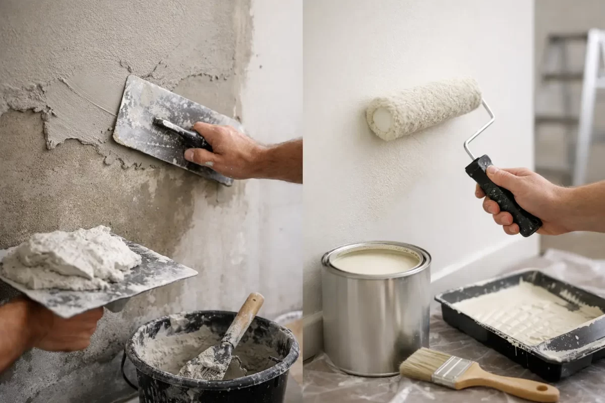
Plastering or Painting First? Get the Order Right

A fresh coat of paint cannot hide a wall that is uneven, cracked or poorly repaired. When homeowners ask whether to tackle plastering or painting first, the answer is usually clear: complete the plastering work first, then paint once the surface is properly dry, prepared and primed.

Getting the order right saves time, avoids unnecessary rework and gives your walls and ceilings the clean finish you expect. It also helps protect your investment, whether you are updating one room, renovating an entire home or preparing a commercial space for new tenants.

Plastering or Painting First? Plaster First

Plastering should be completed before painting in almost every situation. Plasterers repair holes, cover joins, smooth damaged sections and level out imperfections before paint is applied. Their work involves wet materials, sanding dust and surface preparation, all of which can damage or contaminate freshly painted areas.

Painting first may seem like a way to get ahead, particularly if the plaster repairs look small. In practice, it often creates extra work. A repaired section will need to be sanded, sealed and painted anyway, while dust can settle on nearby painted walls, skirting boards and fittings. The result can be patchy colour, rough texture or visible repair lines under certain lighting.

The correct sequence is generally simple: repair and plaster the surface, allow it to dry, sand it smooth, apply the appropriate sealer or primer, then paint. Each stage supports the next one.

Why Painting Over Unfinished Plaster Causes Problems

New or repaired plaster is highly absorbent. If paint is applied directly without the correct preparation, it can soak in unevenly. This may leave dull patches, inconsistent sheen or areas where the final colour looks noticeably different from the rest of the wall.

Moisture is another concern. Plaster needs adequate drying time before it is sealed and painted. Painting over a damp surface can trap moisture, which may affect adhesion and lead to blistering, peeling or staining later on. Gold Coast humidity can slow the drying process, especially in closed-up rooms, bathrooms, laundries and properties where ventilation is limited.

There is also the issue of finish quality. Even a small raised edge around a patch repair can become obvious once paint catches the light. Professional preparation includes feathering repair edges, sanding carefully and checking the wall from different angles before painting begins. The goal is for the repair to disappear, not simply be covered.

The Best Order for Walls and Ceilings

For most interior projects, plastering and painting work should follow a planned sequence. This keeps the site cleaner and makes it easier to produce a consistent result.

1. Assess the existing surfaces

Before work starts, inspect walls and ceilings for cracks, dents, loose plaster, water marks and previous repairs. Not every crack is cosmetic. Movement, moisture or a leaking roof can cause recurring damage, so the underlying issue should be addressed before patching and painting.

A thorough assessment also identifies whether the old paint is sound. Flaking or unstable coatings may need further preparation before any repairs or new paint are applied.

2. Complete repairs and plastering

Holes from picture hooks, removed wall fixtures, electrical work or renovation changes should be filled and smoothed. Larger repairs, damaged cornices, wall cracks and new plasterboard joints may require more detailed plastering work.

This is the stage for achieving a level surface. Rushing it can leave ripples, joint lines and repair patches that remain visible after painting. A quality paint finish starts well before the paint tin is opened.

3. Allow the plaster to dry fully

Drying time depends on the product used, the depth of the repair, room temperature and airflow. Thin patches may dry relatively quickly, while larger plastering work can take much longer. A professional will assess the surface rather than relying on a fixed timeframe.

Trying to speed things up with paint is false economy. If there is any doubt about moisture, waiting is the safer option.

4. Sand, clean and seal the surface

Once dry, the plaster is sanded to blend smoothly into the surrounding wall or ceiling. All dust needs to be removed before paint goes on. This matters more than many people realise: fine plaster dust can interfere with adhesion and leave a gritty finish.

A suitable sealer or primer is then applied, particularly over new plaster and repairs. This evens out the surface porosity, helps the paint bond properly and creates a more uniform finish coat.

5. Paint the ceilings, walls and trim

With preparation complete, painting can proceed in the usual order. Ceilings are generally painted before walls so any splatter can be dealt with while wall finishes are still to come. Doors, frames, skirtings and other trim are normally painted after the main wall areas, depending on the scope of the project and the selected paint system.

Careful cutting-in, consistent roller application and enough drying time between coats make a real difference to the final appearance.

When Painting May Come Before Plastering

There are limited cases where painting can happen before minor plastering work, but these are exceptions rather than the rule. For example, a property may be receiving a broad repaint now, with planned alterations or wall-mounted cabinetry to be installed later. In that case, the later repairs will still require spot priming and touch-up painting after plastering is finished.

Likewise, if a single tiny nail hole is found after a room has been painted, it may be practical to fill it and carry out a small touch-up. Matching sheen and colour can be difficult, though, particularly on older paintwork exposed to sunlight and general wear.

For renovation projects, it is usually better to coordinate the trades so plastering is complete before the final painting stage. This reduces the chance of other work damaging finished surfaces.

Don’t Forget About Water Damage and Cracks

A wall stain or crack should not automatically be treated as a painting problem. Brown marks on a ceiling, bubbling paint near a window or repeated cracking around door frames may point to moisture, movement or another issue beneath the surface.

Painting over water damage without fixing the leak can lead to the stain returning. Filling an active crack without understanding why it formed can produce the same result. A proper approach deals with the cause first, then repairs, seals and paints the affected area.

This is particularly relevant in coastal properties, where moisture, salt air and strong weather conditions can place extra pressure on exterior finishes and vulnerable building areas.

Choosing the Right Finish After Plaster Repairs

The paint sheen you choose can affect how visible surface imperfections appear. Higher-sheen paints reflect more light and can highlight uneven areas, especially on large walls facing windows or under downlights. Lower-sheen finishes are generally more forgiving, although they still need sound preparation for a professional result.

Colour selection matters too. Deep, dark colours and bright whites can reveal inconsistencies more readily than mid-tone colours. If you are unsure, testing a sample in the room at different times of day is worthwhile. Natural light, warm LEDs and cool lighting can all change how a colour and surface texture appear.

For kitchens, bathrooms and high-traffic areas, the right product is just as important as the colour. These spaces need paint that suits their level of moisture, cleaning and daily use.

A Better Result Starts With Proper Preparation

Plastering and painting are closely connected trades. Treating them as separate jobs without considering the handover between them is where many projects lose quality. Good plastering gives paint a sound, smooth base. Good painting protects that surface and gives the room its finished character.

For homeowners and property managers, working with a team that can manage both stages removes guesswork about timing, materials and finish expectations. Jag Painting Solutions can assess the condition of your walls and ceilings, recommend the right preparation and provide a clear quote for the work required.

If your surfaces need repair, make that the first job. Once the plaster is dry, smooth and properly sealed, your chosen paint colour has the best chance to look clean, even and built to last.

Categories
Uncategorized

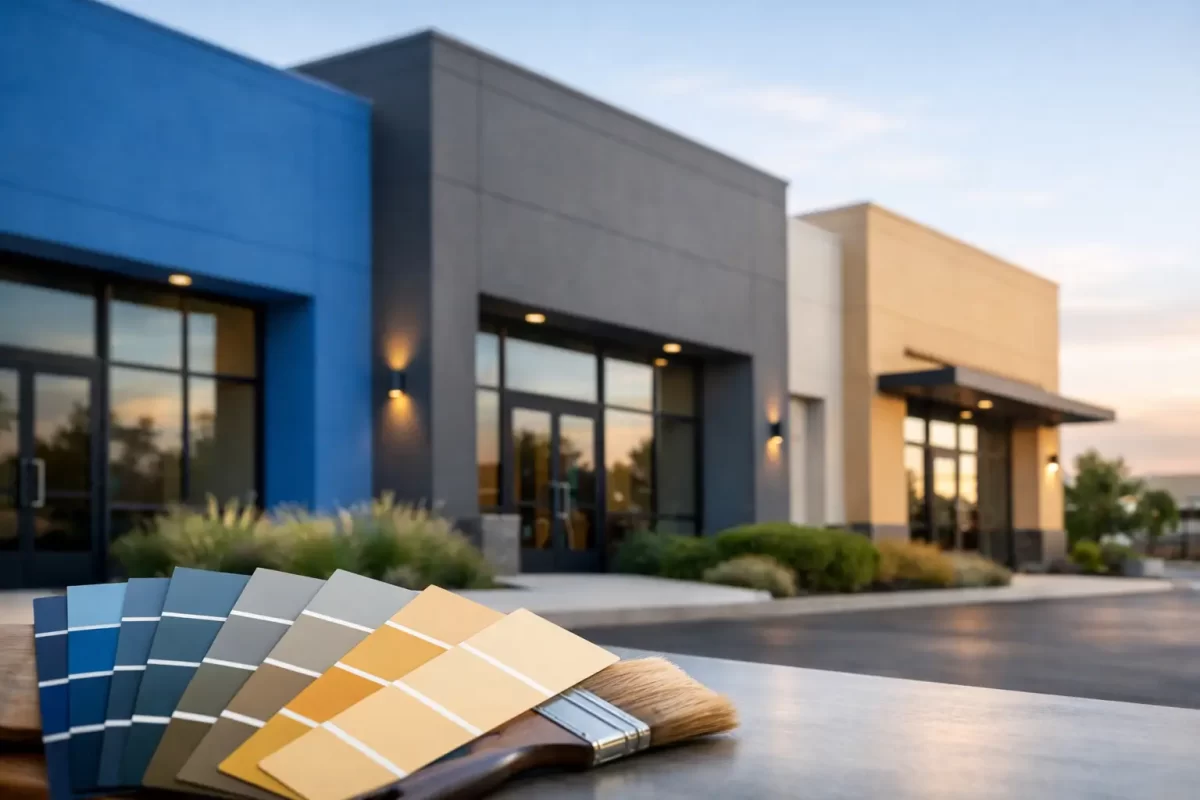
Top Commercial Paint Colours for Lasting Appeal

The top commercial paint colours are rarely the loudest or most fashion-driven choices. For a retail shop, office, medical practice, strata foyer or hospitality venue, the right colour scheme needs to work hard every day. It should suit the people using the space, support your brand, stand up to regular cleaning and still look professional long after the painters have packed up.

Commercial colour selection is about more than choosing a shade from a fan deck. Light levels, foot traffic, the condition of the surfaces and the type of business all affect the result. A colour that looks excellent in a small sample can feel cold, overly bright or impractical once it covers a large wall.

Top commercial paint colours that work in real spaces

The most successful commercial schemes usually begin with a neutral base, then use deeper or more distinctive colours where they have a clear purpose. Neutrals give a premises flexibility as furniture, signage and displays change. Accent colours provide personality without making the entire fit-out difficult to maintain or update.

Warm whites for clean, welcoming interiors

Warm white remains one of the most dependable choices for commercial interiors. Unlike a stark blue-white, it has a soft undertone that makes reception areas, treatment rooms, offices and retail spaces feel brighter without appearing clinical.

This option works particularly well where natural light is limited or where a business wants a clean backdrop for artwork, stock, signage or furnishings. Warm whites also make touch-ups and future changes easier, provided the same product and colour are recorded for later maintenance.

The trade-off is that very light walls can show scuffs in high-contact areas. In corridors, entrances and behind seating, a washable low-sheen finish is often a better choice than a flat finish. Good surface preparation also matters. A quality paint cannot hide dents, failing plaster or poorly repaired patches.

Soft greys for a professional, flexible look

Soft grey has earned its place among the top commercial paint colours because it is adaptable. It can feel modern and refined in an office, calm in a consulting room or understated in a showroom. Mid-light greys are generally more forgiving than white in busy areas, especially where walls are regularly brushed by bags, chairs or trolleys.

Undertones need careful attention. A cool grey can look sharp in a bright, contemporary workplace, but it may feel uninviting in a space with little daylight. Greys with a slight warm or greige undertone tend to be easier to live with and sit comfortably alongside timber, black fixtures and most flooring types.

Before committing, view larger sample areas on more than one wall. Morning and afternoon light can change a grey dramatically, particularly in Gold Coast premises with strong natural light.

Greige and taupe for warmth without fuss

Greige, taupe and muted stone colours offer the practical benefits of a neutral with a more welcoming feel than standard grey. They are a strong choice for professional service businesses, apartment common areas, cafés, salons and hospitality spaces where comfort is part of the customer experience.

These shades are also useful when the room includes beige tiles, natural timber or warm flooring that may clash with cooler grey walls. A well-chosen greige makes older finishes look more considered without forcing a full renovation.

Darker versions can be used below dado height or in hallways to reduce the visibility of everyday marks. Balance them with lighter ceilings and trims so the room does not become heavy.

Deep charcoal and navy for confident feature walls

Charcoal and navy can give a commercial interior a clear sense of identity when used with restraint. They work well behind a reception desk, on a branded wall, in meeting rooms, or as a backdrop for light signage and displays. They can also add depth to large open spaces that would otherwise feel plain.

These colours are not the right answer for every wall. In a small or poorly lit room, a deep shade can make the space feel enclosed. Dark colours also show dust, fingerprints and uneven repair work more readily, so the preparation and finish need to be of a high standard.

When using a feature colour, consider what sits against it. White lettering, pale timber, brass details and indoor greenery can all look effective, but the combination should support the business rather than compete with it.

Muted green for calm and connection

Sage, olive and eucalyptus greens have become popular in commercial settings because they bring in a natural, settled feel. They are well suited to wellness businesses, cafés, waiting areas, studios and workplaces that want a softer alternative to grey.

Muted greens generally perform better than bright greens over a large area. They feel less tied to a passing trend and work with both warm and cool finishes. A pale sage can replace a neutral on full walls, while a deeper olive is often better reserved for joinery, feature walls or selected zones.

As with every coloured paint, check how it responds to artificial lighting. Some green tones can look noticeably different under cool LED lighting than they do in daylight.

Earthy terracotta and clay for hospitality spaces

Soft terracotta, clay and muted rust tones can create warmth and character in cafés, restaurants, boutiques and creative spaces. Used carefully, they make a premises feel more memorable than a standard neutral scheme.

The key is moderation. These colours can be excellent on one wall, within a dining nook or around an entry point, but may feel overwhelming across every surface. They also need to work with the existing fit-out. If the floor tiles, upholstery and timber already carry strong warm tones, a softer neutral may provide better balance.

Choose colour by how the space is used

The best colour for a commercial premises depends on the job the room needs to do. A reception area should feel clear, welcoming and aligned with your business. A corridor needs to disguise minor marks and remain easy to clean. A staff room can handle more personality, while a consultation room may need quieter colours that help people feel at ease.

For retail spaces, colour should support the products rather than overpower them. White, soft grey or warm stone walls often let merchandise stand out, with brand colours used in targeted areas. Offices usually benefit from a calm base palette, while meeting rooms can take a stronger feature colour to create focus and definition.

For medical, allied health and beauty settings, cleanliness is essential, but pure white is not always necessary. Warm whites, pale greys and gentle greens can look hygienic while creating a more comfortable experience for clients.

External commercial colour choices need a different approach. Sun exposure, heavy rain, salt air near the coast and the condition of existing surfaces all need to be considered. Light and mid-tone neutrals are often more forgiving outdoors, while carefully selected darker trims can add contrast without absorbing heat across large areas.

Do not overlook sheen and durability

Colour gets most of the attention, but the paint finish has a major effect on how well commercial walls perform. Flat or matt finishes can look refined, yet they are less suitable for walls that need frequent wiping. Low-sheen products provide a practical balance for many interiors because they are more washable while still hiding minor surface imperfections.

Satin and semi-gloss finishes are usually better for doors, trims, skirting boards and high-contact areas. They are durable and easy to clean, although their higher reflectivity can expose imperfections if the surface preparation is rushed.

In busy commercial premises, investing in proper preparation, suitable primers and quality coatings is more cost-effective than repainting early because the finish has failed. Plaster repairs, patching and sanding should be completed carefully before the first coat is applied. The final colour can only look as good as the surface beneath it.

Test before you commit

A small colour card is useful for narrowing options, but it is not enough for a final decision. Apply sample patches in the actual room, preferably on more than one wall, and look at them throughout the day. Check them under the lighting used after hours as well.

Consider surrounding elements at the same time: floor finishes, cabinetry, window frames, signage, furniture and exterior cladding. A colour that works in isolation may not work once it meets the existing materials in your premises.

For larger projects, a simple colour plan keeps the result consistent across reception areas, offices, hallways and external spaces. It also makes future maintenance easier, particularly for property managers and businesses with multiple rooms or tenancies.

A commercial repaint is a chance to improve how people experience your business before a word is spoken. With considered colour selection, thorough preparation and a professional finish, your premises can feel better maintained, more welcoming and ready for the work that happens inside it. If you are planning a refresh, Jag Painting Solutions can provide practical colour guidance and a clear quote for your project.

Categories
Uncategorized

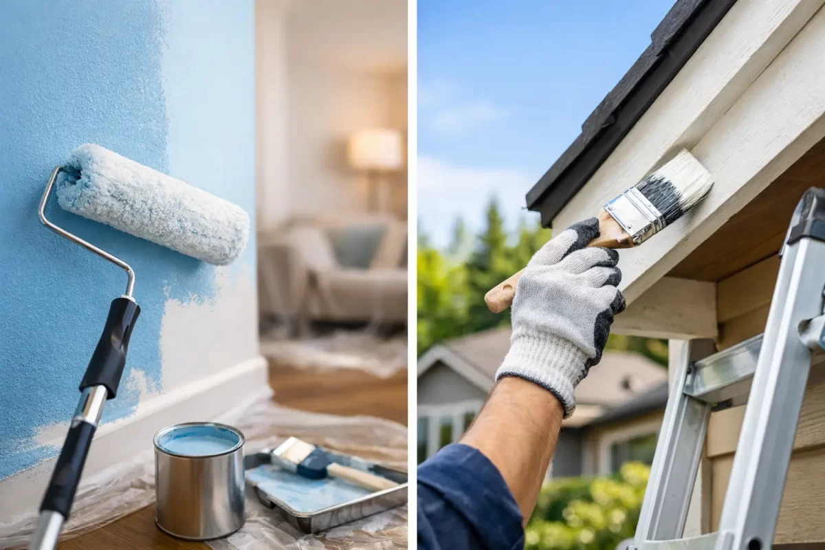
Interior Versus Exterior Paint: What Changes?

A tin of paint can look much the same on the shelf, but choosing interior versus exterior paint is not simply a matter of picking the right colour. The coating on a bedroom wall has a very different job from the coating on a weatherboard, rendered wall or front fence. Using the wrong product can lead to early peeling, cracking, staining or a finish that never quite looks right.

For property owners, the best result comes from matching the paint system to the surface, its exposure and the way the area is used. That starts with understanding what each type of paint is designed to do.

Interior versus exterior paint: the key difference

Interior paint is made for controlled environments. It needs to provide an attractive, even finish, resist marks and allow routine cleaning without damaging the surface. Most internal paints are formulated with lower odour and lower volatile organic compound levels, making them more suitable for enclosed living and working spaces.

Exterior paint has a tougher assignment. It must cope with sun, rain, humidity, temperature changes and airborne contaminants while still adhering to the surface beneath it. On the Gold Coast and in Tweed, strong UV exposure, summer storms and coastal salt can place extra pressure on exterior coatings.

The main difference is flexibility. Exterior paint generally contains resins that allow the coating to expand and contract as timber, masonry and other materials respond to changing weather. Interior paint is usually harder, which helps it stand up to fingerprints, scuffs and regular washing, but that harder film can crack when used outside.

Why exterior paint should stay outside

It is tempting to use leftover exterior paint indoors, especially for a garage, laundry or utility area. While some exterior products may adhere, they are not designed around indoor comfort or the appearance expected in living spaces.

Exterior coatings can contain mildewcides and other additives intended to combat moisture and biological growth. They may also have a stronger odour and take longer to fully cure. Their finish can be less refined on plasterboard, and their flexibility is unnecessary inside a stable room.

There are exceptions. A professionally specified exterior-grade system may be appropriate for some high-moisture or semi-exposed areas, such as particular outdoor rooms or breezeways. The decision should be based on the substrate and conditions, rather than assuming tougher paint is always better paint.

Why interior paint fails outdoors

Interior paint can look excellent immediately after application to an exterior wall. The problem tends to appear after the coating has been exposed to repeated sunshine and rain. Without the same level of UV resistance and flexibility, the finish may fade, chalk, blister or peel away from the surface.

Exterior surfaces also hold moisture differently. Masonry can absorb water, timber can swell, and metal can heat rapidly in direct sun. A proper exterior system accounts for these movements and often includes primers or sealers designed for the material. Applying interior wall paint directly over a weathered exterior surface skips the protection the building needs.

The same principle applies to ceilings under eaves, external doors and timber trims. Although they may be partly sheltered, they are still exposed to outdoor humidity, reflected heat and changing temperatures. They need an exterior-rated coating unless a painter has assessed the area and specified otherwise.

Finish matters as much as paint type

The sheen level changes both the appearance and practical performance of a painted surface. For interiors, low-sheen finishes are a common choice for walls because they soften minor imperfections while remaining easier to clean than flat paint. Flat or matt finishes can work well on ceilings, where low reflectivity helps conceal joins and surface variation.

In kitchens, hallways, children’s rooms and commercial spaces, a washable low sheen or semi-gloss can make sense because these areas receive more contact and cleaning. Doors, skirting boards and architraves often suit semi-gloss or gloss finishes, depending on the look of the property and the existing paint system.

Outside, low sheen is often used on broad rendered or fibre-cement surfaces because it offers a modern appearance without highlighting every small imperfection. Semi-gloss or gloss is more commonly selected for doors, trims, railings and selected timber features. Higher sheen can be easier to wash, but it also reveals uneven preparation, brush marks and surface defects more readily.

This is one reason professional preparation matters. The correct paint cannot hide loose plaster, failed caulking, cracked render or rough timber. It will only make those issues more visible once light catches the new finish.

Preparation changes from room to room and surface to surface

A quality paint job is built on the surface underneath. Interior preparation often involves protecting floors and furniture, filling dents and nail holes, repairing minor plaster damage, sanding, sealing stains and applying an appropriate undercoat where needed. Bathrooms, laundries and kitchens also need attention to mould, grease and moisture-prone areas before painting begins.

Exterior preparation is usually more demanding. It may involve pressure cleaning, washing down salt residue, scraping loose paint, sanding weathered timber, treating mould, filling cracks, re-caulking gaps and spot-priming exposed areas. Render, brick, timber, metal and previously painted surfaces all call for different preparation and primers.

Timing matters outside as well. Paint needs suitable weather conditions to dry and cure properly. Rain, high humidity, excessive heat or a surface that is still damp can compromise adhesion and finish. An experienced painter plans exterior work around the forecast instead of rushing a coat on because the calendar says the job should be finished.

Choosing paint for Gold Coast conditions

The Gold Coast climate can be hard on external finishes. North- and west-facing walls receive intense sunlight, while shaded sides of a property may be more prone to moisture and mould. Homes near the coast can also collect salt deposits that interfere with paint adhesion if they are not thoroughly cleaned before repainting.

For exterior work, look for products specifically rated for Australian UV conditions and suited to the surface being painted. A quality acrylic exterior coating is a reliable option for many rendered, masonry and fibre-cement surfaces, while timber, metal and decking may require more specialised systems. Paint selection should also consider the existing coating. Not every product is compatible with every old surface.

Colour has a practical effect too. Dark colours absorb more heat, which can place extra stress on exterior timber, cladding and some lightweight building materials. They can look striking, but they need the right preparation, product specification and substrate. A colour consultation can help balance the look you want with the practical demands of the property.

When one project needs both paint systems

Renovations often include interior and exterior work at the same time. New plaster repairs, repainted living areas, refreshed eaves, repaired trims and an updated façade may all be part of one project. Treating every surface as if it takes the same product is where costly mistakes begin.

A clear scope should identify each surface, the preparation required, the primer or sealer where needed, the selected finish and the number of coats. This gives you a better basis for comparing quotes than a single line that simply says “paint house”. It also helps prevent surprises once work has started.

At Jag Painting Solutions, the focus is on assessing the surfaces properly before recommending a paint system. That includes helping clients choose colours and finishes that suit how the property is used, not just how it looks on a small sample card.

A better way to make the decision

Start by asking where the surface sits and what it has to withstand. Is it a plasterboard wall in a low-traffic room, a busy stairwell, a rendered wall facing afternoon sun, or timber exposed to rain? Then consider its current condition. Peeling paint, mould, stains and cracks are preparation issues first, and paint-selection issues second.

If you are planning a repaint, avoid buying paint before the surface has been checked. A little guidance at that stage can save the cost and disruption of repainting far sooner than expected. The right coating, applied over careful preparation, protects the property and gives every room or exterior surface the finish it deserves.

Categories
Uncategorized

Painter Helensvale Homeowners Can Rely On

A freshly painted room can look impressive for a week. The real test comes later, when sunlight hits the walls, doors are opened and closed every day, and the finish still looks clean, even and well cared for. Choosing a painter Helensvale homeowners can rely on is about more than selecting a colour or finding the lowest quote. It is about preparation, communication and workmanship that holds up.

For homes, renovations and commercial spaces in Helensvale, painting is often the final stage that brings a project together. It can also expose every shortcut taken beforehand. Uneven plaster, poorly repaired cracks, rough trim and mismatched sheen levels are far more noticeable once the paint has dried. A professional painter should help prevent those issues, not paint over them.

What a Quality Painting Job Really Includes

The visible coat of paint matters, but most of the work that creates a lasting finish happens before the first topcoat is applied. Walls need to be assessed properly for dents, cracking, water damage, flaking paint and previous patch repairs. Timberwork may require sanding, filling and priming. Exterior surfaces may need washing and treatment before they are ready for paint.

Preparation is where a quality job separates itself from a quick refresh. If a surface is not clean, dry and sound, even premium paint can struggle to perform as it should. On exterior areas, this may lead to early peeling or blistering. Inside, poor preparation can leave visible patch edges, roller marks or an uneven texture that is difficult to ignore once furniture is back in place.

A reliable painting contractor will explain what they have found and recommend the right approach. Sometimes a simple repaint is appropriate. Other times, plaster repairs, stain blocking, extra sanding or a more durable coating system will be needed. The best option depends on the condition of the surface, the room’s use and the result you expect.

Surface Repairs Should Not Be an Afterthought

Small cracks and holes are common in lived-in homes, especially after picture hooks, shelving, old fixtures or minor settling. They should be repaired carefully rather than rushed over. A smooth wall finish requires the repair to be filled, sanded, sealed where needed and blended into the surrounding surface.

This is particularly important when painting in natural light or using low-sheen and darker colours. These finishes can make imperfections more obvious. A painter who also understands plastering can manage the repair and painting stages as one coordinated job, rather than leaving you to organise separate trades.

Choosing Colours That Work in Your Space

Colour selection often feels straightforward until paint samples are on the wall. The same white can look cool in one room and creamy in another. A charcoal feature wall may look refined in a large, well-lit living room but feel heavy in a narrow hallway. Exterior colours can change dramatically between bright Gold Coast sun, overcast weather and late afternoon shade.

A good colour consultation is not about pushing the latest trend. It should consider the home’s existing finishes, flooring, cabinetry, roof colour, natural light and the atmosphere you want to create. For a renovation intended for sale or lease, a broadly appealing palette may be the sensible choice. For a long-term family home, there may be more room to choose colours that reflect your own style.

Paint sheen also deserves attention. Flat or matte finishes can create a soft, contemporary look, but they may be less practical on high-traffic walls. Washable low-sheen options are often a useful balance for living spaces. Semi-gloss or gloss paints are commonly used on doors, skirting boards and trims because they are more durable and easier to clean, although higher sheen levels can highlight surface flaws.

There is no single right answer. The right choice is one that suits the surface, the level of wear and the way the space is used.

What to Expect From a Professional Painter in Helensvale

Painting work takes place in your home or business, so the way a team operates matters as much as the finished result. Clear communication before and during the job helps remove uncertainty. You should know what areas are included, what preparation is required, what products are proposed and how the work will be scheduled.

Respect for the property is equally important. Floors, furniture and nearby surfaces should be protected, and the work area should be kept orderly throughout the project. At the end of each day, a professional team should leave the site in a safe, tidy condition rather than treating your home as a building site.

For occupied homes, the schedule may need to work around family routines, pets, access requirements or rooms that cannot be out of action at the same time. Commercial projects can have different pressures, such as minimising disruption to staff, customers or tenants. An experienced contractor will discuss these practical details early, rather than making assumptions once the work has started.

A Clear Quote Is Worth More Than a Cheap Figure

It is understandable to compare quotes, but the lowest price does not always represent the best value. One quote may include surface repairs, primers, quality coatings and full protection of your furnishings. Another may allow only for basic paint application, with additional work charged later or preparation kept to a minimum.

When reviewing a painting quote, look beyond the final figure. Ask what rooms or exterior areas are covered, whether repairs are included, how many coats are allowed for and whether paints and finishes are specified. It is also reasonable to ask about expected timing, access arrangements and how changes to the scope will be handled.

A detailed quote creates a clearer starting point for everyone. It helps you compare like with like and gives the painting team a practical plan for delivering the agreed result.

Interior Painting That Changes How a Home Feels

Interior painting can make a tired property feel cleaner, brighter and more considered without changing its layout. It is one of the most effective upgrades before selling, moving in or completing a renovation. The difference is especially noticeable in open-plan spaces, hallways, stairwells and rooms where marks and wear have built up over time.

The key is not simply covering the old colour. Ceilings, walls, doors, frames, skirting boards and feature details all need to work together. Fresh white trim can sharpen the whole room, while a well-chosen wall colour can improve the sense of light and space. In older homes, careful preparation often makes the biggest visual difference.

If you are painting only part of a house, consider how the new colour will meet existing rooms. A sharp contrast can be intentional, but an accidental mismatch can make a home feel unfinished. A professional can help create a practical transition between spaces.

Exterior Painting Is Protection as Well as Presentation

On the Gold Coast, exterior paintwork has a demanding job. Sun, moisture, rain and coastal conditions can gradually wear down painted surfaces. Faded fascia boards, chalky walls, cracking timber paint and rust-stained areas do more than affect street appeal. They can allow the underlying surface to deteriorate if left too long.

An exterior painting project should begin with a close inspection. Different materials need different treatment: timber, rendered masonry, fibre cement, metal and previously painted surfaces each have their own preparation and coating requirements. The correct primer and paint system are just as important as colour choice.

Regular maintenance can reduce the scale and cost of future work. If paint is beginning to fail, dealing with it before widespread peeling develops is generally easier than waiting until extensive stripping and repairs are needed. A professional assessment can help you decide whether a touch-up, targeted repair or full repaint is the sensible next step.

A Better Experience From Start to Finish

The best painting projects feel organised from the first conversation. You receive straightforward advice, a clear scope of work and a team that turns up prepared to take care of the space. That approach is particularly valuable when the project involves more than paint, such as plaster repairs, a renovation handover or a commercial refresh with a firm deadline.

Jag Painting Solutions provides interior, exterior and commercial painting, plastering and colour guidance for property owners who want quality workmanship without unnecessary stress. The focus should always be on a finish that looks right, performs well and suits the way you use the property.

Before requesting a quote, walk through the space and make note of the areas that concern you most: visible cracks, peeling exterior paint, marked walls, water stains or colours that no longer suit the room. Sharing those details early gives your painter the best chance to recommend a practical solution and deliver a result you will be happy to live with.

Categories
Uncategorized

Best Exterior Finishes for Coastal Homes in Australia

Salt does not need to be visible on a wall to cause trouble. On coastal properties, fine airborne salt settles on paintwork, metalwork, windows and timber, then combines with humidity, rain and strong UV exposure. Choosing the best exterior finishes for coastal homes is therefore about more than picking an attractive colour. It is about selecting a complete system that suits the surface, holds up to the local conditions and can be maintained without constant repairs.

For homes across the Gold Coast and Tweed, the right finish protects the building while keeping it looking cared for. The wrong one can chalk, peel, crack, fade or allow moisture to work its way beneath the coating far sooner than expected.

Best exterior finishes for coastal homes start with the surface

There is no single exterior coating that is best for every coastal property. A finish that performs well on rendered masonry may not be suitable for weatherboards, and a product designed for metal will not protect timber. The condition of the existing surface matters just as much as the material itself.

Before any finish is chosen, the surface needs to be checked for loose paint, chalking, rust, cracks, damp areas, mould and failed sealant. Coastal homes often have more than one of these issues at once, particularly on the sides facing prevailing weather.

Preparation is where a long-lasting paint job is won or lost. Salt, dirt and powdery old paint must be removed properly. Cracks need flexible filling, bare areas require the right primer, and surfaces must be dry before coating begins. Painting over a tired or contaminated surface may look good for a short time, but it will not deliver the protection a coastal home needs.

Exterior acrylic paint for masonry and render

For painted brick, fibre cement, render and masonry, a premium exterior acrylic coating is usually the practical choice. Quality acrylic paints are formulated to handle movement, moisture and harsh sunlight better than basic exterior paints. They offer strong colour retention and are easier to wash down as part of regular coastal maintenance.

A low-sheen finish is often a sensible option for rendered walls. It provides a clean, modern appearance while hiding minor surface imperfections better than a higher sheen. Flat finishes can look elegant, but they tend to mark more easily and may be harder to clean. Semi-gloss is durable and washable, though it can highlight uneven render, patching or hairline defects.

On newer render, allow proper curing time before painting. On older render, investigate any cracking rather than simply coating over it. Fine hairline cracks may be addressed with suitable preparation and a flexible coating system, while larger cracks can point to movement or substrate problems that need attention first.

When elastomeric coatings are worth considering

Elastomeric masonry coatings are thicker and more flexible than standard exterior paint. They can be a worthwhile option for rendered homes with recurring hairline cracking or exposed walls that face hard weather. Their flexibility helps bridge minor movement and can improve water resistance when applied as part of the correct system.

The trade-off is that elastomeric coatings need careful application and suitable conditions. They are not a shortcut for damp walls, major cracks or failed render. If moisture is already trapped behind the surface, applying a highly protective coating can make the underlying issue harder to resolve.

Weatherboards and timber need breathable protection

Timber moves with changes in temperature and moisture. On a coastal home, that movement is often increased by humidity, rain and prolonged sun exposure. The finish must be able to cope with this movement while protecting exposed timber from water entry and UV damage.

For painted weatherboards, exterior acrylic paint over a quality timber primer is a dependable system. Attention to end grain, joints, nail holes and cut edges is especially important, as these are common points for water to enter. Caulking should be flexible and paintable, not a hard filler that will split as the timber expands and contracts.

For natural timber features, an exterior stain or oil can preserve the grain and create a warmer look. This finish is popular for screens, decks, cladding and feature posts, but it requires realistic maintenance expectations. Clear and lightly pigmented finishes generally need more frequent recoating than opaque paint, especially on north- or west-facing areas.

A pigmented stain provides better UV defence than a clear coating because the pigment helps shield the timber from sunlight. Even then, timber exposed to salt air and direct weather should be inspected regularly. If the coating begins to wear thin, recoat before the timber turns grey, splits or absorbs excessive moisture.

Metal finishes must address corrosion first

Metal fences, balustrades, roofing components, gates and steel posts are especially vulnerable near the coast. Once corrosion begins under a coating, painting over the top will not stop it. Rust needs to be removed or treated correctly, then the bare metal must be primed with a compatible anti-corrosive primer before topcoats are applied.

For steel and wrought iron, a quality exterior metal paint system provides the required barrier against moisture and salt. Preparation may include scraping, sanding, mechanical abrasion or rust treatment, depending on the extent of corrosion. Areas around welds, joints, fasteners and the bottom of gates deserve close attention because water commonly sits there.

Aluminium needs a different approach. It does not rust like steel, but it can oxidise and lose adhesion if incorrectly prepared. Thorough cleaning, suitable abrasion where required and a primer designed for aluminium are essential before topcoating.

For coastal metalwork, darker colours can look sharp but may become hotter in full sun. Heat can contribute to coating stress and make some surfaces uncomfortable to touch. This does not rule out dark colours, but it is worth discussing colour placement and finish selection before committing.

The right sheen protects more than appearance

Paint sheen affects how a home looks, how easily it cleans and how well it disguises imperfections. For most coastal homes, a balanced approach works best: low sheen on broad wall areas, with semi-gloss or gloss on trims, doors and other high-contact surfaces.

Higher-sheen paints generally form a tougher, more washable surface, which is useful for fascias, doors, window trims and handrails. They also make architectural details stand out. However, gloss reflects light strongly and will reveal poor preparation, brush marks and uneven substrate conditions.

Light and mid-tone colours are often easier to live with in exposed coastal locations. They tend to absorb less heat and can disguise salt residue and fading better than very dark shades. That said, the best colour is one that suits the home, roof, surrounding landscape and maintenance expectations. A considered colour consultation can prevent expensive changes after the work is complete.

Don’t overlook rooflines, eaves and exposed details

Coastal damage often begins in places that are easy to miss from ground level. Eaves, fascias, soffits, pergolas, external ceilings and window sills can collect moisture and salt while receiving less routine cleaning than main walls. A sound exterior finish includes these details, not just the most visible elevations.

Particular care is needed where different materials meet, such as timber trim against render, metal flashings against cladding or sealant joints around windows. These transitions are common entry points for water. Quality preparation, compatible primers and correctly applied sealants give the topcoat a far better chance of lasting.

Maintenance keeps coastal finishes working

Even premium coatings benefit from regular care. A gentle wash with fresh water removes salt build-up before it has time to dull paint, encourage corrosion or hold moisture against the surface. This is particularly valuable after periods of strong onshore winds or storms.

Avoid blasting exterior paintwork at close range with a high-pressure cleaner, as it can force water behind coatings or damage weakened areas. Instead, use a soft brush or low-pressure wash where appropriate, then inspect for peeling, cracking, rust spots, mould and deteriorating sealant.

A practical coastal maintenance routine includes checking the exterior at least once a year, with closer attention to weather-facing walls and exposed timber or metal. Small repairs completed early are simpler and more affordable than repainting after widespread coating failure.

Choose a finish system, not just a paint colour

The best result comes from matching the coating system to the material, exposure level and condition of the home. A premium topcoat matters, but it cannot compensate for poor preparation, unsuitable primers or neglected repairs. Coastal properties ask more of every painted surface, so workmanship and product compatibility should guide the decision.

If your exterior is showing chalking, peeling paint, rust or fading after a few tough summers, it is a good time to have the surfaces assessed before the damage spreads. Jag Painting Solutions can help Gold Coast and Tweed property owners choose practical exterior finishes that protect the home and suit its style, with careful preparation and a clear, professional finish from start to finish.