

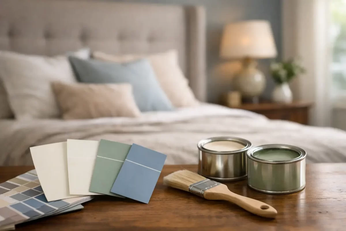
A paint sample can look soft and inviting in the shop, then feel completely different once it is on all four bedroom walls. Natural light, artificial lighting, flooring, linen and the size of the room all influence the result. That is why choosing the best paint colours for bedrooms is less about following a trend and more about creating a space that feels comfortable at the beginning and end of every day.
A bedroom does not need to be plain to be restful. It simply needs a colour that works with the room itself and the way you want to use it. Whether you are updating one room or preparing a whole home renovation, taking a little time to test colours properly can prevent an expensive change of mind later.
Start with the feeling you want from the room
Before looking at paint cards, consider how you want the bedroom to feel. Most people want a calm, private space, but calm can mean different things. For some, it is a light warm neutral with natural textures. For others, it is a deep green or blue that makes the room feel quieter and more enclosed.
Soft whites, warm greiges, muted greens, dusty blues and gentle pink-based neutrals are reliable choices because they are easy to live with. They also give you flexibility if you change bedding, curtains or furniture over time. A well-chosen neutral should not feel cold or unfinished. It should give the room a settled background and let the furnishings do their job.
If you prefer more colour, choose a toned-down version rather than the brightest option on the card. A muted sage generally feels more restful than a vivid leaf green. A smoky blue is often easier to live with than a strong cobalt. Bedrooms are used in low light as much as daylight, so colours with a little grey, brown or earthy warmth usually sit more comfortably across the day.
Best paint colours for bedrooms by mood
Warm whites and soft neutrals
Warm white remains a practical choice for bedrooms, particularly in homes with timber furniture, beige carpet, stone finishes or layered neutral linen. Look for whites with a soft cream, beige or grey undertone rather than a sharp, stark white. A pure cool white can make a south-facing room feel flat and chilly.
Greige, putty, mushroom and pale taupe are excellent alternatives when white feels too bare. These shades add depth without making a room noticeably dark. They are also a sensible option for resale, rental properties and renovation projects where you want a polished result that appeals to a wide range of tastes.
The trade-off is that subtle neutrals can appear quite different beside existing finishes. A greige with a pink undertone may clash with yellow-toned timber, while a cooler grey can look blue against creamy tiles. Always view samples against the surfaces that are staying in the room.
Soft greens for a grounded feel
Sage, eucalyptus, olive-grey and softened khaki tones work beautifully in bedrooms because they bring in a connection to nature without demanding attention. They pair well with timber, rattan, warm white trims and off-white bedding.
On the Gold Coast, where bright daylight can make pale colours look lighter than expected, a mid-tone muted green can be a good choice. It holds its character in sunny rooms and still feels relaxed at night. In a darker bedroom, however, choose a lighter sage or use the deeper colour on a feature wall only.
Blues that help a room feel calm
Blue is a popular bedroom colour for good reason. Soft blue-grey, misty blue and muted denim shades can make a room feel cooler and more settled, especially in rooms that receive strong afternoon sun. They also work well in coastal homes without turning the space into a themed beach room.
Very pale blue can read almost white in bright light and may feel cold when paired with cool grey flooring. Balance it with warm timber, natural fabrics or warmer white trims. Deeper navy and ink blue can create a smart, cocooning look, but they suit rooms with reasonable natural light or thoughtful layered lighting. In a small, poorly lit room, they can feel heavy if used wall to wall.
Blush, clay and gentle earthy tones
Muted blush, pale terracotta, soft apricot and clay-based neutrals can make a bedroom feel warm and personal. These colours are particularly effective where the home has warm flooring, aged brass details or earthy textiles. They can be more forgiving than cool grey when the room has limited natural light.
The key is restraint. Choose a softened, dusty shade rather than a bright pink or orange if you want a finish that will still feel right in a few years. Earthy tones are often best supported by clean, warm white ceilings and trims so the room retains a sense of lightness.
Deep colours for a more cocooned bedroom
Deep charcoal, forest green, navy, plum and chocolate brown can all work in a bedroom when used with confidence. Dark walls can blur the edges of a room, making the space feel intimate rather than smaller. They are particularly effective in larger bedrooms, rooms with high ceilings or spaces where the aim is a hotel-like atmosphere.
A darker scheme needs more consideration than a light neutral. Ceiling colour, window coverings, bedside lighting and sheen level become more noticeable. If you are unsure, paint the wall behind the bed in the deeper shade and keep the remaining walls lighter. This creates focus without committing the whole room to a dark finish.
Check the light before making a final choice
Light is often the deciding factor between a colour that looks right and one that disappoints. North-facing bedrooms usually receive warmer light and can handle cooler colours well. South-facing rooms receive less direct light, so warmer whites and softer earthy tones often prevent them from feeling dull.
East-facing rooms are bright in the morning and cooler later in the day. West-facing rooms can become very warm in the afternoon, where blue-grey, soft green and balanced neutrals can provide relief. These are guides, not rules. The surrounding trees, neighbouring buildings, window size and existing finishes will change the result.
Paint sample boards are more useful than small swatches. Apply two coats to a large board, then move it around the room and check it in morning, afternoon and evening light. Hold it beside the flooring, wardrobe, bedhead and curtains. This extra step is one of the simplest ways to make a confident colour decision.
Do not overlook ceilings, trims and finish
Walls are only one part of the finished bedroom. A crisp white ceiling can lift a room, while a ceiling painted in the same colour as the walls can create a softer, more enveloping feel. In smaller bedrooms, keeping the ceiling light is usually the safer option. In larger rooms, a full-colour treatment can be striking when the shade is muted or dark.
For trims, a warm white generally works well with warm neutrals, green and earthy shades. A cooler white may better suit blue-grey walls. The difference can be subtle, but mismatched undertones are often what makes a finished room feel slightly off.
Most bedroom walls suit a low-sheen or washable matte finish. Matte finishes reduce glare and help conceal minor surface imperfections, giving the room a calm appearance. Low sheen offers a little more durability and is a practical choice for children’s rooms or high-use spaces. The preparation underneath matters just as much as the paint itself. Clean repairs, smooth sanding and careful cutting-in are what give a painted room its professional finish.
A practical approach to choosing your colour
Begin with the elements you are not changing, such as carpet, flooring, built-in wardrobes or a favourite bedhead. Then narrow your choices to two or three colours that work with those finishes. It is easier to select paint around fixed items than to repaint because a colour clashes with them later.
Think about the bedroom as part of the wider home as well. Each room does not need to be identical, but colours should feel connected as you move through the house. A warm neutral main bedroom, soft green guest room and muted blue children’s room can work together when they share a similar depth and undertone.
For homeowners who would rather not make the call alone, professional colour guidance can save time and avoid costly repainting. Jag Painting Solutions works with clients to consider lighting, existing finishes and the overall look they want before painting begins. The right colour choice, paired with careful preparation and skilled application, makes the bedroom feel like it belongs in the home from day one.
Take samples home, live with them for a few days and trust the colour that still feels comfortable in the evening. That is often the one you will be happiest waking up to.


