

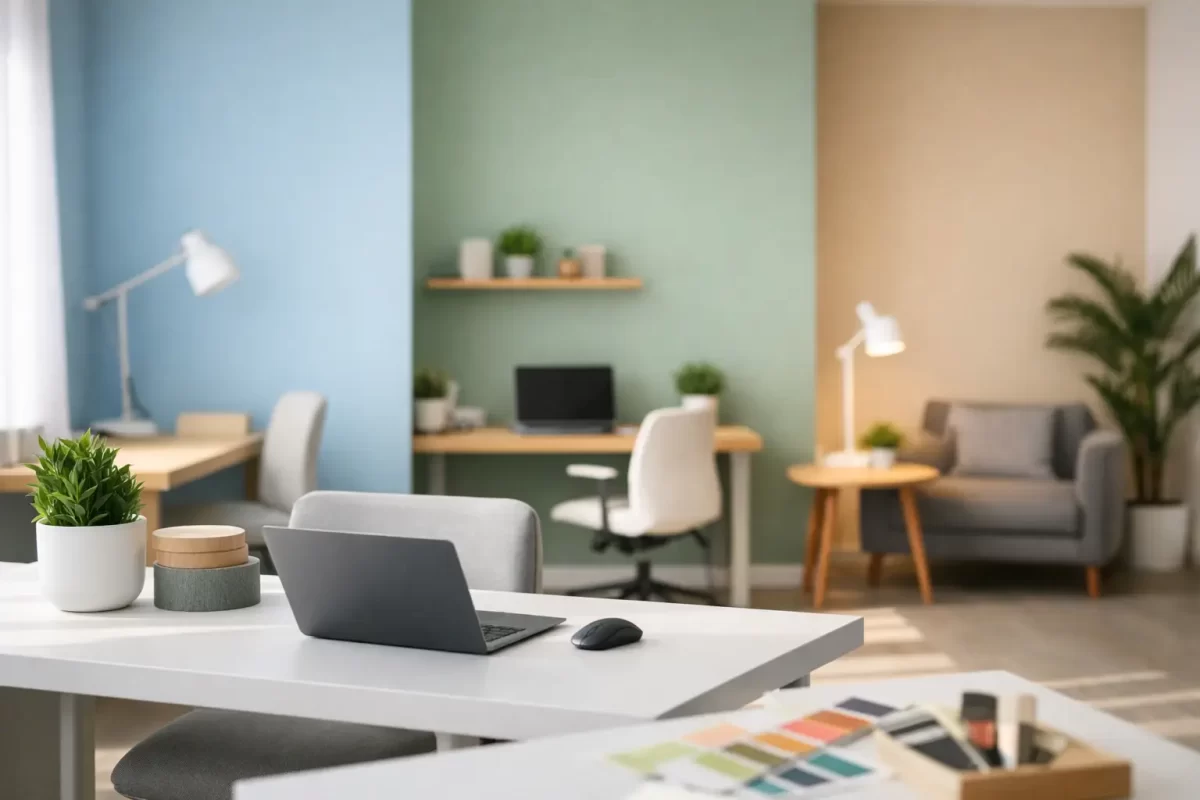
A fresh office fit-out can look excellent on paper, then feel flat or distracting once the paint is on the walls. The best office paint colours need to do more than match a logo or look good in a sample pot. They should support the way people work, suit the available light and give clients confidence from the moment they walk through reception.
For Gold Coast and Tweed businesses, colour selection also needs to account for strong natural light, heat and the practical demands of a busy workplace. A considered paint scheme can make a compact office feel more open, bring calm to high-pressure areas and help a commercial space look well maintained for longer.
Start with how each part of the office is used
There is no single best colour for every office. A quiet accounting practice, a creative studio, a medical reception and a warehouse administration area all have different needs. Before choosing a palette, consider what happens in each space, who uses it and how long they spend there.
Reception areas need to feel welcoming and professional. Open-plan workspaces benefit from colours that reduce visual fatigue rather than compete for attention. Meeting rooms can carry a little more personality, while private offices may suit warmer tones that make conversations feel less formal.
It also pays to look beyond the walls. Existing flooring, desks, joinery, window furnishings and signage all affect how a paint colour will read. Choosing a colour in isolation is one of the quickest ways to end up with a finish that feels slightly off.
Best office paint colours for different work zones
Warm whites for flexible, professional interiors
Warm white remains a dependable choice for offices because it is clean without feeling clinical. It works particularly well in reception spaces, corridors and workplaces with timber furniture, charcoal carpet tiles or black aluminium framing.
Avoid choosing a bright, stark white simply because it seems safe. In a sunlit Gold Coast office, very cool white can create glare and make the room feel harsh. A soft white with a subtle cream, beige or grey undertone usually gives a more comfortable result while still reflecting plenty of light.
Warm whites are also a practical base for businesses that update their furniture, graphics or branding over time. They allow feature colours to change without requiring a full repaint.
Soft greys for a modern, balanced look
Soft grey is a useful neutral when white feels too plain. Pale greys can make an office look polished and contemporary, especially alongside light timber, glass partitions and matte black details. They are well suited to boardrooms, professional service offices and commercial tenancy refreshes.
The trade-off is undertone. Some greys lean blue or purple and can feel cold under fluorescent lighting or on overcast days. Others have a warmer, greige base and are generally easier to live with. Testing large sample patches on different walls is essential, as the same grey can change noticeably between morning and afternoon light.
Muted greens for calm and concentration
Sage, eucalyptus and soft olive tones are increasingly popular in offices for good reason. These colours bring a calm, grounded feel without becoming dull, and they sit naturally beside timber, plants and neutral furnishings.
Muted green works well as a feature wall in a meeting room, a breakout zone or behind a reception desk. In smaller offices, use it selectively rather than painting every wall. A full room of dark green may feel refined in a large, well-lit space, but can make a compact room feel enclosed.
For businesses wanting a more relaxed and approachable feel, green is often a better long-term option than brighter trend colours. It has character, but it does not usually dominate the room.
Blue tones for focus and trust
Blue has a strong association with clarity, trust and professionalism, making it a natural fit for many workplaces. Soft blue-greys can suit consulting rooms and focused work areas, while deeper navy can create a confident backdrop in a boardroom or reception area.
Use darker blues with care. They can look sharp against white trims and quality joinery, but they need good lighting and a clean surface finish. Dark paint also shows scuffs, patchy touch-ups and poor preparation more readily than lighter colours. In high-traffic zones, selecting the right sheen level and applying it properly makes a real difference to how the wall wears.
Earthy neutrals for welcoming client spaces
Light sand, mushroom, clay and taupe shades can make a client-facing office feel more comfortable and established. They work especially well for property, wellness, legal and service businesses where the aim is to put visitors at ease.
These tones are not as stark as white and generally hide minor marks better than very pale finishes. The key is keeping them light enough to retain brightness. Deep brown or heavily yellow beige can date an office quickly, particularly when paired with older fluorescent lighting.
Charcoal and black for controlled contrast
Dark charcoal or black can give an office a premium, contemporary edge, but it is rarely the best choice for every wall. It is more effective on a single feature wall, internal framing, a reception backdrop or selected joinery.
Strong contrast can help define a space and reinforce brand presence. However, it may also reduce light levels and make a small office feel smaller. If the room has limited windows, balance dark paint with lighter surrounding walls, suitable artificial lighting and reflective finishes where appropriate.
Consider light before committing to a colour
Natural light changes paint more than most people expect. North-facing windows often bring warmer, stronger light, while south-facing rooms can make colours appear cooler and more subdued. Artificial lighting matters just as much, particularly in offices that operate early, late or away from windows.
Paint small sections of wall, not just a sample card, and view them at several times of day. Place samples near desks, doors, windows and existing furnishings. This gives a far more accurate picture of how the colour will perform once the office is in use.
Sheen should be chosen at the same time. Low-sheen finishes are popular for office walls because they give a refined look and reduce obvious glare. They still need sound plastering and preparation underneath, as any dents, joins or uneven surfaces can show through once light hits the wall. In corridors, kitchens and other high-contact areas, a more washable finish may be worth considering for easier maintenance.
Make branding part of the scheme, not the whole scheme
Many businesses feel pressure to paint large areas in their brand colours. This can work when the brand palette is neutral or restrained, but bright corporate colours often become tiring when used wall to wall.
A better approach is usually to build the office around a calm base palette, then bring brand colours into a feature wall, signage zone, meeting room detail or selected painted elements. This keeps the workplace professional and helps the brand stand out without overwhelming staff and visitors.
If your business is leasing a commercial space, a balanced scheme can also make future changes easier. Neutral main walls have broad appeal and may reduce the work required when a tenancy changes hands.
Preparation matters as much as the colour
Even the right colour will not look professional over damaged plaster, poorly repaired holes or uneven previous coatings. Commercial interiors often have more wall wear than expected, particularly around desks, corridors, light switches and reception counters.
Proper preparation may include patching, sanding, sealing stained areas and repairing plasterboard before the first coat goes on. This is where experienced painters add value. A smooth, consistent finish helps colours look true, wears better in daily use and gives the whole workplace a more considered appearance.
For a business, timing is equally important. A planned painting project can often be staged around operating hours, staff access and furniture movement to reduce disruption. Clear communication about preparation, drying times and access requirements helps keep the job straightforward.
Choosing colours with confidence
The best office paint colours are usually the ones that make work easier without drawing attention to themselves every day. Warm whites and soft greys provide a reliable foundation. Muted greens, calm blues and earthy neutrals add personality where it suits the space, while deeper colours work best as deliberate accents.
A professional colour consultation can help narrow the choices before work begins, particularly where natural light, existing finishes or brand colours complicate the decision. Jag Painting Solutions works with business owners to select practical colours and deliver a high-quality finish that respects the workplace.
Choose a scheme that reflects your business, supports the people using the space and will still feel right after the novelty of a new paint colour has passed.


