

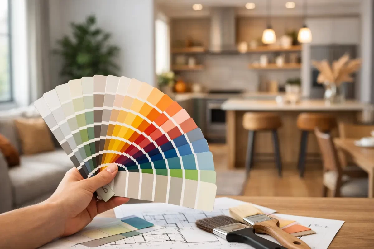
An open-plan home can look generous and light-filled one minute, then feel cold, noisy or visually cluttered after the wrong paint colours go on the walls. Choosing colours for open plan homes is less about finding one perfect shade and more about creating a considered relationship between each living area.
In homes across the Gold Coast and Tweed, strong natural light, large windows and indoor-outdoor living can make colour decisions feel even more noticeable. What looks soft and neutral on a small paint card may appear much brighter on a broad living room wall. A practical colour plan helps every area feel connected while still giving each space a clear purpose.
Start With How Each Area Will Be Used
Open-plan living does not mean every wall needs to be the same colour. It does mean the colours need to work together from the moment you walk through the space.
Begin by considering the zones within the room: kitchen, dining, living area, entry and perhaps a study nook or children’s play space. Think about how each one is used, when it is used, and what feeling you want it to have. A kitchen may suit a clean, fresh neutral that works with cabinetry and splashbacks, while the lounge area may benefit from a warmer tone that feels more relaxed in the evening.
The key is to avoid treating these zones as completely separate rooms. Strongly contrasting wall colours can chop up an open area and make it appear smaller. Instead, choose colours with a shared undertone. For example, warm white walls can sit comfortably beside sandy beige, muted olive or soft terracotta accents. Cooler whites tend to work better with greys, blue-greens and charcoal details.
Before selecting paint, take stock of the fixed finishes you are keeping. Flooring, kitchen benchtops, cabinetry, tiles, window frames and large furniture all influence which colours will look right. Paint is flexible, but it should support the elements that are expensive or difficult to replace.
Choosing Colours for Open Plan Homes With Flow
A simple whole-home palette usually provides the best result. This does not have to mean a house painted in one shade from front door to back fence. It means selecting a main wall colour, then choosing a small number of supporting colours that relate to it.
A dependable approach is to use one main neutral across the largest connected walls. This creates continuity through the entry, living and dining areas, especially where there are long sightlines. Add variation through feature walls, adjoining rooms, joinery, furnishings or architectural details rather than changing the main colour every few metres.
For many homes, three to five colours is enough for the interior palette. That may include the main wall colour, trims and ceilings, a deeper accent, and one or two shades for bedrooms or smaller spaces. More colours can work, particularly in character homes, but they need careful planning. Without a clear connection, the result can feel pieced together rather than finished.
Use Tone Before You Focus on Colour
Tone is the lightness or darkness of a colour, and it often matters more than whether you choose green, blue, beige or grey. Similar tones generally create a calmer flow. A very dark feature wall beside pale, bright walls creates a stronger statement and may suit a defined dining zone or media area, but it will naturally draw attention.
If you want a spacious, easy-going feel, keep the tonal contrast gentle. Select a main light neutral, then use mid-tone accents through paint, timber, rugs and upholstery. If you want more drama, keep it intentional. One deep wall behind a dining table or television can anchor the room without making every part of the space compete.
Respect the Direction of Natural Light
Paint colours change throughout the day. A shade that looks creamy in a sunlit showroom can look grey in a south-facing room, while a warm afternoon-facing living area can make beige and yellow-based colours appear much stronger.
On the Gold Coast, bright daylight can also wash out pale colours and make cool whites look stark. This does not rule out white walls. It simply means the undertone must be chosen carefully. Warmer whites often bring softness to living spaces with tiled floors, while a cleaner white may suit a contemporary home with cooler finishes and plenty of timber or texture to balance it.
Always test large sample patches on more than one wall. View them in the morning, afternoon and under artificial lighting at night. Better still, paint sample boards and move them around the room. A colour sample beside a window may look entirely different from the same colour on an internal wall.
Create Definition Without Breaking Up the Space
The best open-plan schemes make zones feel purposeful without relying on walls that are no longer there. Colour can help, but it works best alongside other elements such as furniture placement, lighting, rugs and cabinetry.
A feature colour can define a dining wall, draw attention to a fireplace or give a study nook its own identity. In a kitchen, a darker colour on a walk-in pantry door or island can add depth while the surrounding walls remain light. These smaller applications are often more successful than painting every zone a different colour.
Ceilings and trims also deserve attention. A crisp white ceiling can lift a room, but a ceiling white that clashes with creamy walls can look accidental. Choosing a compatible trim and ceiling colour gives the whole job a cleaner, more professional finish. In some homes, using the wall colour on trims creates a softer, more modern look, although it can reduce contrast around doors and windows.
Know When a Feature Wall Helps
Feature walls are useful when they have a reason. They can highlight an architectural element, create a backdrop for artwork or visually ground a large room. They are less effective when they are used simply because the space feels plain.
Choose the wall people naturally look towards, such as the wall behind a sofa, dining setting or bed. Avoid a random narrow wall or one broken up by several doors and windows, as the colour can look fragmented. In an open-plan room, a feature colour should relate directly to the main wall shade and nearby finishes.
Deep navy, charcoal, forest green and earthy clay tones can all look excellent in the right setting. They are not automatically suitable for every room, though. A dark colour absorbs light and can make a poorly lit corner feel heavier. If you love a bolder shade but are unsure, consider using it on a smaller wall, internal door or joinery feature first.
Avoid Common Colour Planning Mistakes
One of the most common mistakes is selecting colours in isolation. A paint card may look appealing, but it needs to be tested against the flooring, kitchen finishes and furnishings that will surround it. Another is choosing a colour based on a photo online. Screen settings, photography and lighting can change the appearance significantly.
It is also easy to underestimate the impact of sheen level. Flat or low-sheen finishes are popular on interior walls because they reduce glare and soften minor surface imperfections. Higher-sheen paints are more reflective and generally easier to wipe, but they can highlight uneven plastering or wall damage. The right preparation and finish selection are as important as the colour itself.
Finally, do not make the entire scheme neutral out of fear of getting it wrong. Neutrals are a strong foundation, but an open-plan home still needs warmth, depth and personality. Texture, timber, artwork, plants and a carefully chosen accent colour can make a restrained palette feel welcoming rather than bland.
Get the Preparation and Finish Right
Even the best colour plan will disappoint if the walls are poorly prepared or the paint is applied unevenly. Open-plan areas have broad, uninterrupted walls where roller marks, patchy coverage and poorly repaired plaster stand out quickly, especially in natural light.
Professional preparation includes filling cracks and dents, sanding repairs smooth, sealing where needed and protecting floors, furniture and adjoining surfaces. This is particularly valuable during renovations, when new plasterwork may sit alongside older walls and require careful blending before painting begins.
A colour consultation can also save time and costly changes. An experienced painter can assess the light, existing finishes and practical demands of the space, then help narrow the options to colours that suit your home rather than simply following a passing trend.
At Jag Painting Solutions, the focus is on helping clients achieve a finish that looks right in the space and holds up to everyday living. A well-planned palette, careful surface preparation and quality application give an open-plan home the calm, connected feel it was designed to have.
Take the time to test colours properly before work begins. The right choice should still feel good when the afternoon sun shifts, dinner is on the table and the whole household is using the room as it was meant to be used.


