

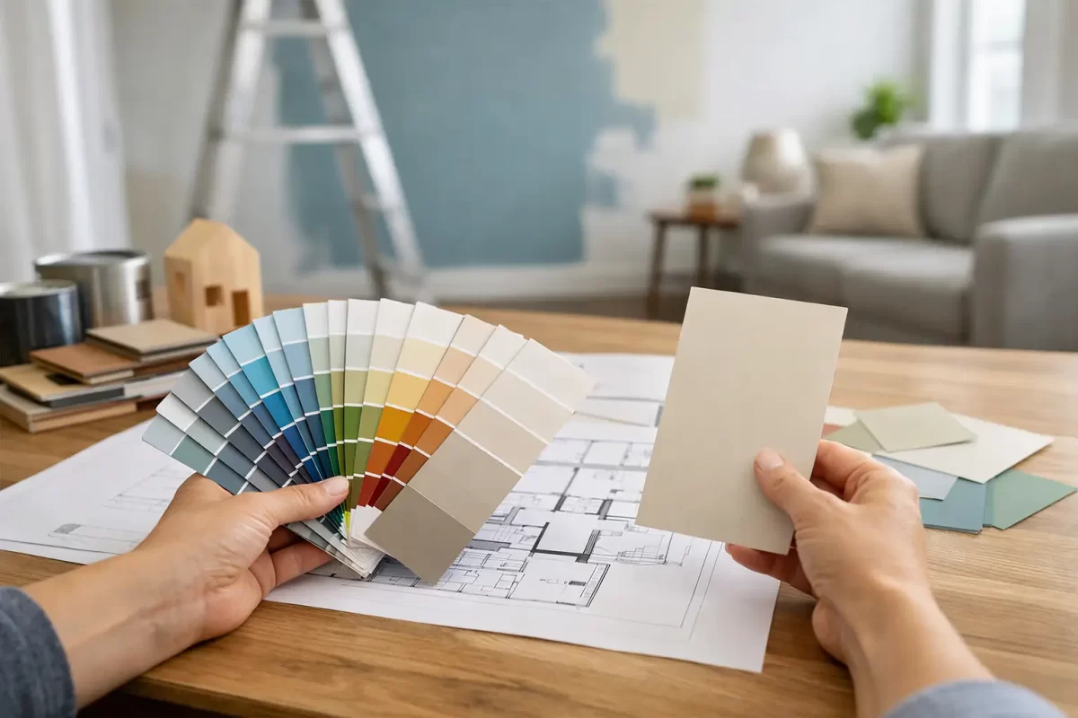
A renovation can be beautifully planned, well built and finished with quality materials, yet still feel slightly wrong once the paint goes on. That is why a colour consultation for renovations is more than choosing a favourite white or picking a feature wall. It is the process of making sure every painted surface works with the light, layout, fixed finishes and purpose of the space.
For homeowners, colour decisions often arrive when there are already plenty of other choices competing for attention. Tiles, benchtops, flooring, cabinetry, window furnishings and exterior materials can make even a simple paint selection feel overwhelming. Professional guidance helps turn those separate decisions into a clear, considered scheme that suits the property and can be applied properly by experienced painters.
Why paint colour needs a renovation plan
Paint is one of the last major finishes applied, but it influences almost everything you see. A wall colour can make new cabinetry look warmer or cooler, make ceilings seem higher, soften a busy room or expose undertones in a floor that were not obvious in the showroom.
The common mistake is choosing colours in isolation. A small swatch under shop lighting may look clean and neutral, then appear blue-grey in a south-facing bedroom or creamy beside bright white architraves. Colour is affected by surrounding surfaces, natural light, artificial lighting and even the amount of glass in a room.
This matters on the Gold Coast, where strong daylight and indoor-outdoor living are part of many homes. Colours that look restrained in a sample can appear much brighter in open-plan living areas. Exterior colours also need to sit comfortably with roofs, paving, fencing, landscaping and neighbouring streetscapes. The right choice is not always the trendiest shade. It is the shade that performs well where it will actually be used.
What a colour consultation for renovations covers
A useful consultation starts with the renovation itself, not a fan deck. The aim is to understand what is changing, what is staying and how the finished property needs to feel and function.
Start with the fixed elements
Fixed finishes should lead the discussion because they are expensive or difficult to replace. This includes flooring, stone, tiles, splashbacks, cabinetry, brickwork, roofing and existing window frames. Their undertones are particularly important.
For example, a benchtop described as white may contain warm beige veining, soft grey movement or a cool blue cast. A paint colour that looks like a safe neutral on its own can clash once it sits against that surface. Looking at these materials together makes it easier to select complementary wall, trim and ceiling colours.
Consider each room’s light and use
A consultation should also account for orientation and how the room is used. Warm afternoon sun can intensify yellow or red undertones, while shaded rooms may benefit from a colour with more warmth and depth. Bathrooms, hallways and bedrooms do not necessarily need the same treatment as a large family room, even when the home needs a consistent overall look.
This does not mean every room needs a different colour. In fact, too many changes can make a renovated home feel disjointed. Often, a restrained main wall colour paired with carefully selected variations for bedrooms, wet areas or feature zones produces a calmer result.
Build a whole-home palette
The strongest renovation schemes usually have a simple structure. There may be a main wall colour, a ceiling white, a trim colour, one or two deeper accents and an exterior palette that relates back to the interior. This creates continuity when doors are open and when people move from the entry through to living spaces and outdoors.
A whole-home approach also helps with practical decisions. If a colour is used across several rooms, buying and touching up paint later is easier. It can also reduce unnecessary complexity during the painting stage, without making the finished home look plain.
Whites and neutrals are not automatically easy
White remains a popular renovation choice because it feels fresh, works with many styles and gives buyers or tenants a broadly appealing backdrop. But white is one of the colours most likely to disappoint when selected without testing.
Some whites carry yellow, pink, grey, green or blue undertones. The wrong one can make new white cabinetry look dull, exaggerate a cool tiled floor or make a room feel stark. Trim colour matters too. Using a crisp, cool white on trims beside a warm wall white can look deliberate in some homes, but accidental in others.
Neutrals need the same attention. Greys can read cold, taupes can turn mauve, and beige tones can appear muddy when they do not relate to the flooring or stone. The goal is not to avoid these colours. It is to choose them with the room’s existing finishes and light in mind.
Test colours on the actual surfaces
Digital inspiration is useful for narrowing down a style, but it cannot show how a paint colour will behave in your home. Mobile screens, edited photography and different paint finishes all change colour perception.
Sample pots or larger painted boards allow colours to be viewed at different times of day. Test them beside flooring, cabinetry and tiles, rather than on an empty wall alone. Look at them in morning light, afternoon light and under the lighting you will use at night.
Paint boards are often more useful than small patches because they can be moved around the room. They also avoid a common issue: when several test patches sit directly beside one another, each colour can influence how the next one appears. If patches are painted on the wall, use enough paint to achieve proper coverage and assess the colour away from strong contrasts.
Choose paint finishes for real life
Colour selection and finish selection should happen together. The same colour can look different in matt, low sheen, satin or gloss. More reflective finishes tend to show more light and can reveal surface imperfections, while lower-sheen products offer a softer look.
There is no single right finish for every renovation. Living areas and bedrooms often suit low-sheen wall finishes, while kitchens, bathrooms, laundry areas and high-traffic spaces may need a more washable, durable option. Doors, trims and skirtings generally require a tougher finish that stands up to knocks, cleaning and daily use.
Surface preparation also affects the final appearance. Fresh plaster repairs, uneven walls, old paint failure and poorly finished patching can show through, especially under angled light or with darker colours. A professional painting team assesses these details before painting so the finish supports the colour choice rather than undermining it.
Exterior colour is a practical decision too
Exterior painting has visual impact, but it also needs to work with the building’s materials and exposure. A very dark colour can look striking, yet it may absorb more heat and show dust, salt residue or weathering sooner depending on the location and surface. Very light colours can brighten an exterior but may show marks around entry points or under eaves.
The best exterior palettes consider the roof, gutters, driveway, masonry, timber, fencing and landscaping as one composition. They should also suit the style of the home. A coastal property, a brick family home and a contemporary commercial premises may all call for different levels of contrast and colour depth.
If the renovation is intended to improve resale appeal, it is usually wise to avoid highly personal exterior choices unless they genuinely suit the architecture. A well-balanced neutral palette with considered accents can add street appeal without dating quickly.
When to arrange colour guidance
Bring colour advice into the project before final paint purchasing and ideally before fixed finishes are completely locked in. Once tiles, stone and cabinetry have been selected, a painter or colour consultant can help make the paint scheme work around them. If those materials are still being chosen, early advice can prevent a collection of finishes that compete with each other.
It is also worth arranging guidance before exterior repairs, plastering or major preparation begins. That allows the painting scope, finish levels and product requirements to be planned properly. It reduces last-minute changes that can delay the job or add avoidable cost.
At Jag Painting Solutions, colour guidance is approached as part of the finishing process, not a quick opinion at the end. The focus is on practical choices that suit the property, the renovation budget and the result you want to live with.
Before committing to a colour, stand back from the sample, look at it in the light you use every day and check it beside the finishes that are staying. A considered decision at that point can make the whole renovation feel settled, polished and genuinely your own.


