

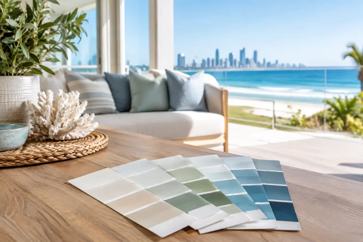
A coastal home should feel calm and light, but choosing the right paint colours is rarely as simple as picking a pale blue and white. On the Gold Coast, strong sunlight, salt air and lush surroundings can change how a colour looks from one wall to the next. This coastal home colour guide will help you choose a scheme that feels right for your property and continues to look good once it is exposed to real coastal conditions.
The best result is not about copying a display home or following a short-lived trend. It is about selecting colours that suit your home’s architecture, the available light, existing finishes and the way you want to live in the space.
Start with the light around your home
Coastal light is bright, often harsh and constantly changing. A white that appears soft and warm on a paint card can look stark outside at midday. A grey with a cool undertone may turn noticeably blue in a south-facing room, while deep colours can become much stronger under direct sun.
Before settling on a colour, paint a generous sample on the actual wall or use large sample boards. Check it in the morning, afternoon and evening, rather than making a decision under showroom lighting. This matters particularly for exterior work, where sunlight and reflected light from paving, pools, windows and neighbouring homes can alter the final appearance.
On the Gold Coast, north and west-facing elevations receive intense sun. Softer mid-tones and warm whites generally cope well visually in these areas. Very dark exterior colours can look dramatic, but they absorb more heat and may show fading, chalking or movement in some substrates sooner. They can still be an excellent choice when used deliberately on a feature area, entry or architectural detail rather than across every external surface.
Build a coastal palette from fixed elements
Paint is one of the most flexible parts of a renovation, so it should work with the elements that are expensive or difficult to replace. Start by looking at your roof, brickwork, stone, tiles, flooring, benchtops, window frames and decking.
A home with cream tiles and warm timber will usually sit better with creamy whites, sandy beiges, muted greens or warm greys. By contrast, a property with concrete finishes, charcoal roofing and crisp aluminium frames may suit cleaner whites, soft greys and blue-green accents.
The key is undertone. White is not simply white. It can lean yellow, pink, grey, blue or green. Grey can be warm and earthy or cool and steely. When undertones clash, a freshly painted room can feel unsettled even when every individual colour looked good in isolation.
For a whole-home scheme, choose one main neutral first. From there, select supporting colours that share a similar warmth or coolness. This keeps the result considered without making every room look identical.
Coastal home colour guide: colours that age well
Coastal style does not need to mean a house painted in blue and white. In fact, the most successful coastal homes often take their cues from the natural landscape rather than using obvious beach-themed colours.
Warm whites and soft neutrals
Warm white remains a reliable choice for interiors and exteriors because it reflects light without feeling clinical. It suits weatherboards, rendered homes, modern apartments and classic Queenslander-style properties. A warm off-white also works well with timber, rattan, natural stone and linen furnishings.
Soft beige, putty, mushroom and pale greige are useful alternatives when pure white feels too sharp or impractical. They bring enough depth to define walls while remaining easy to live with. These colours are especially effective in open-plan homes where light changes throughout the day.
Sand, clay and natural earth tones
Sandy tones connect naturally with coastal surroundings and are more forgiving than white on external walls. Pale biscuit, muted clay and light taupe can give an older brick or rendered home a more contemporary appearance without making it feel overly stark.
Earthier shades are also a sensible option for high-traffic interiors. Hallways, family rooms and entryways can benefit from a little more depth, provided the colour is not so dark that it closes in the space.
Muted greens and blue-greens
Eucalypt, sage, olive-grey and muted teal bring colour into a home without overpowering it. They suit bedrooms, studies, powder rooms and joinery, and can work beautifully on a front door or external feature wall.
Choose restrained versions of these shades rather than bright aqua or heavily saturated blue. Strong blues can feel dated quickly and may compete with the view, pool or landscaping. A greyed-off green or blue-green tends to feel more timeless and is easier to coordinate with neutral finishes.
Charcoal and deep accents
Charcoal, deep navy and near-black are useful for creating contrast around doors, trims, fences and selected cladding. They can make a light exterior feel sharper and more architectural.
There is a trade-off. Dark paint is less forgiving of dust, salt residue, surface imperfections and sun exposure. On exterior surfaces, preparation and product selection are just as important as the colour itself. If you love a deep tone, consider using it where it adds impact without carrying the full maintenance burden of an all-dark façade.
Choose exterior colours for more than street appeal
An exterior colour scheme needs to look good from the street, but it must also suit the building materials and environment. Coastal homes are exposed to UV, moisture and, in many locations, airborne salt. A quality exterior coating system, correct surface preparation and attention to gaps, cracks and failing paint will influence durability far more than colour alone.
As a general approach, use a main wall colour, a complementary trim colour and one accent colour. Keeping the palette limited gives the property a clean, professional finish. Too many competing colours can make a façade appear busy, particularly when there are already strong elements such as roof tiles, garage doors, fencing and landscaping.
If your home is close to the beach, avoid treating paint selection as purely decorative. Salt build-up should be cleaned from exterior surfaces, and any peeling, mould, rust staining or damaged render should be addressed before repainting. Applying premium paint over a poorly prepared surface is not a lasting fix.
Create flow indoors without painting every room the same
Interior colour flow makes a home feel larger and more settled. That does not mean every wall needs one shade. It means the colours should relate to each other as you move through the home.
A practical approach is to use a consistent neutral through main living areas, hallways and connecting spaces, then introduce variation in bedrooms, bathrooms or feature zones. A slightly deeper version of the main neutral can add definition to a study or media room. A muted green may work in a bedroom where a brighter living space would not.
Ceilings, doors and trims deserve attention too. Crisp white trims can give contrast against warmer walls, while a softer white across walls and trims can create a quieter, more contemporary look. The right choice depends on the character of the home and the level of detail you want to highlight.
For smaller rooms, do not assume white is the only option. A well-chosen mid-tone can make a powder room or bedroom feel purposeful and inviting. The important part is to test it in the room, with its lighting and furnishings, before committing.
Avoid common colour selection mistakes
Many disappointing paint jobs begin with a good colour used in the wrong context. Choosing from a tiny swatch, matching a photo online or selecting colours room by room without considering the overall home can lead to expensive changes later.
Another common issue is overlooking sheen level. Low-sheen finishes are popular for walls because they provide a soft appearance and hide minor imperfections better than higher sheen paints. Semi-gloss or gloss is commonly used for doors, trims and hard-wearing areas, although the higher the sheen, the more clearly it shows surface flaws. Your paint system should suit both the room and the condition of the surfaces.
It is also worth being realistic about maintenance. Brilliant white external walls, dark fences and very deep feature colours can all look excellent, but they may need more regular cleaning or touch-ups. The best choice balances the look you want with the upkeep you are comfortable managing.
Get the finish right with professional preparation
Colour consultation is valuable because it connects design decisions with the practical realities of paint, light and surface condition. An experienced painter can identify whether old coatings need stripping, whether plaster repairs will show through a low-sheen finish, and which colours are likely to behave differently outdoors.
At Jag Painting Solutions, colour guidance is part of helping clients make confident decisions before work begins. Careful preparation, clean workmanship and the right coating system give your chosen palette the best chance of looking its best for years to come.
Take your time with samples, look beyond the paint card, and choose colours that suit the way your home faces, wears and feels. A considered scheme will do more than freshen the walls – it will make the whole property feel like it belongs where it is.


