

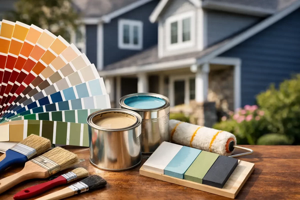
A fresh exterior paint job can make a well-loved home feel completely renewed, but the wrong colour can look very different once it covers every wall. Knowing how to choose exterior paint colours means looking beyond a small paint card and considering the home’s style, fixed features, natural light and local conditions.
For Gold Coast and Tweed property owners, the decision also needs to stand up to strong sun, coastal weather and the way a colour changes throughout the day. A considered colour scheme helps your home look polished now and continues to feel right years after the painters have packed up.
Start with the features you are not changing
The easiest place to begin is with the elements that will remain in place after painting. Roof tiles or Colorbond roofing, brickwork, stone, driveway pavers, timber decking, windows and guttering all influence which paint colours will work.
Look at the undertone rather than simply calling a feature grey, white or brown. A grey roof may lean blue, green or warm charcoal. Cream brick can carry yellow, pink or beige undertones. Choosing a wall colour with a conflicting undertone is one of the main reasons an exterior can feel slightly off, even when each colour looked good on its own.
If your roof is a deep charcoal, for example, soft whites, pale greys and muted greige shades often create a clean, balanced result. A warm terracotta roof may suit warmer whites, sandy neutrals, sage greens or grounded earth tones. You do not need to match every fixed material exactly. The aim is to make the colours look intentional together.
Consider the style and era of the home
Your home’s architecture should guide the direction of the palette. A modern coastal home can carry crisp whites, soft grey-green, pale stone and darker trims with confidence. Queenslanders and character homes often suit warmer heritage-inspired colours, balanced with lighter trims that bring out decorative timberwork.
For brick homes, painting can update the whole street appeal, but it is worth considering how much contrast the building can handle. A single soft neutral across the brickwork and trims can feel calm and contemporary. Strongly contrasting trim colours can highlight doors, eaves and architectural lines, though too many separate colours may make a smaller façade appear busy.
Commercial properties need the same level of care. A scheme should reflect the business while still fitting the building and its surroundings. Clean neutrals with a controlled accent colour usually present more professionally than a selection of bright shades competing for attention.
How to choose exterior paint colours in Gold Coast light
Colour samples are useful, but they are only a starting point. Bright Queensland sunlight can make colours appear lighter, sharper and more intense than they do under indoor lighting. A white that seems soft in a showroom may look stark on a north-facing wall, while a dark charcoal can appear almost black in full sun.
Always test sample pots on large sections of the actual exterior. Paint boards can help, but testing directly on the wall gives you a better view of the texture, aspect and neighbouring surfaces. Check the samples in the morning, at midday and late afternoon before making a final call.
As a general rule, choose a shade slightly softer or more muted than your first instinct. This is particularly relevant for white, black, blue and green tones. Exterior light brings out more colour than most people expect.
Dark colours have a practical trade-off as well. They can create a striking modern look and make lighter features stand out, but they absorb more heat and may show dust, salt residue or surface imperfections more readily. On broad exposed walls, lighter colours are often more forgiving and better suited to the local climate.
Build the scheme from main colour to accents
A clear exterior scheme usually has three layers: a main wall colour, a trim colour and one or two accents. The main colour covers the largest area, so it should be the most adaptable and easiest to live with. Trim colours are used on eaves, fascias, window frames or gutters, depending on the home. Accent colours add personality through the front door, shutters, feature cladding or entry details.
Start by selecting the main colour. Warm white, soft grey, stone, taupe, muted green and pale blue-grey are popular because they work with many roof and landscaping combinations. Once that is set, choose a trim colour that either blends quietly or creates deliberate definition.
A white-on-white scheme, for instance, can look refined if the wall and trim whites have compatible undertones. Pairing a warm creamy wall white with a cool blue-white trim can make both shades look dirty or mismatched. When in doubt, keep the undertones consistent.
Your front door is a good place to use a stronger colour without committing the whole house to it. Navy, deep green, charcoal, black and earthy red can all work well, depending on the home. Test this colour too, particularly if the entry is in direct sun.
Let the surroundings inform the decision
The best exterior colours do not need to copy the landscape, but they should sit comfortably within it. Coastal homes often suit colours drawn from sand, stone, weathered timber, foliage and the softer tones of the ocean. Leafy properties can handle warmer whites and natural neutrals that prevent the house from disappearing into the greenery.
Also take notice of nearby homes, especially in closely built streets, townhouse complexes or estates with design guidelines. Your property does not need to match the neighbours, but a colour that clashes heavily with the streetscape may affect its overall appeal. If you live in a body corporate property or heritage area, check any colour restrictions before buying paint.
Landscaping is part of the finished picture. A dark exterior can make pale paths and lush planting stand out, while a light façade often gives gardens and timber features more visual weight. Think about the colour of your fence, letterbox, garage door and outdoor entertaining area so the final result feels connected rather than pieced together.
Do not overlook sheen and surface preparation
Paint colour is only half the decision. Sheen level changes the way colour reads and how the surface performs. Low-sheen finishes are popular for exterior walls because they offer a subtle appearance and help disguise minor surface variation. Semi-gloss or gloss is often used for doors, trims and metalwork, where a tougher, more defined finish is wanted.
The condition of the surface matters just as much. Faded paint, chalky residue, peeling coatings, cracked render and exposed timber can all affect adhesion and the final appearance. A quality exterior job begins with thorough washing, repairs, sanding, priming where needed and careful protection of surrounding areas.
This preparation is especially important near the coast, where salt air and moisture place extra pressure on exterior coatings. Choosing a suitable premium paint system and applying it correctly gives the colour a better chance of lasting as intended.
Get confidence before committing
Exterior painting is a significant investment, and colour uncertainty is common. A professional colour consultation can save time, sample costs and the disappointment of a colour that looks wrong once it is applied across the home. An experienced painter can assess the existing surfaces, identify undertones in your roof and masonry, and suggest colours that suit the building’s aspect and condition.
It also helps to discuss practical details early, such as whether gutters will be painted, if existing window frames are included, and how feature areas will be treated. Clear decisions before work begins keep the project moving smoothly and help achieve a consistent finish.
At Jag Painting Solutions, we guide homeowners through colour choices as part of a well-planned exterior painting project, with care taken to protect the property and prepare every surface properly.
The right colour scheme should feel considered rather than risky. Take time to view samples in changing light, work with the features already on your property and choose colours you will be pleased to come home to every day.


