

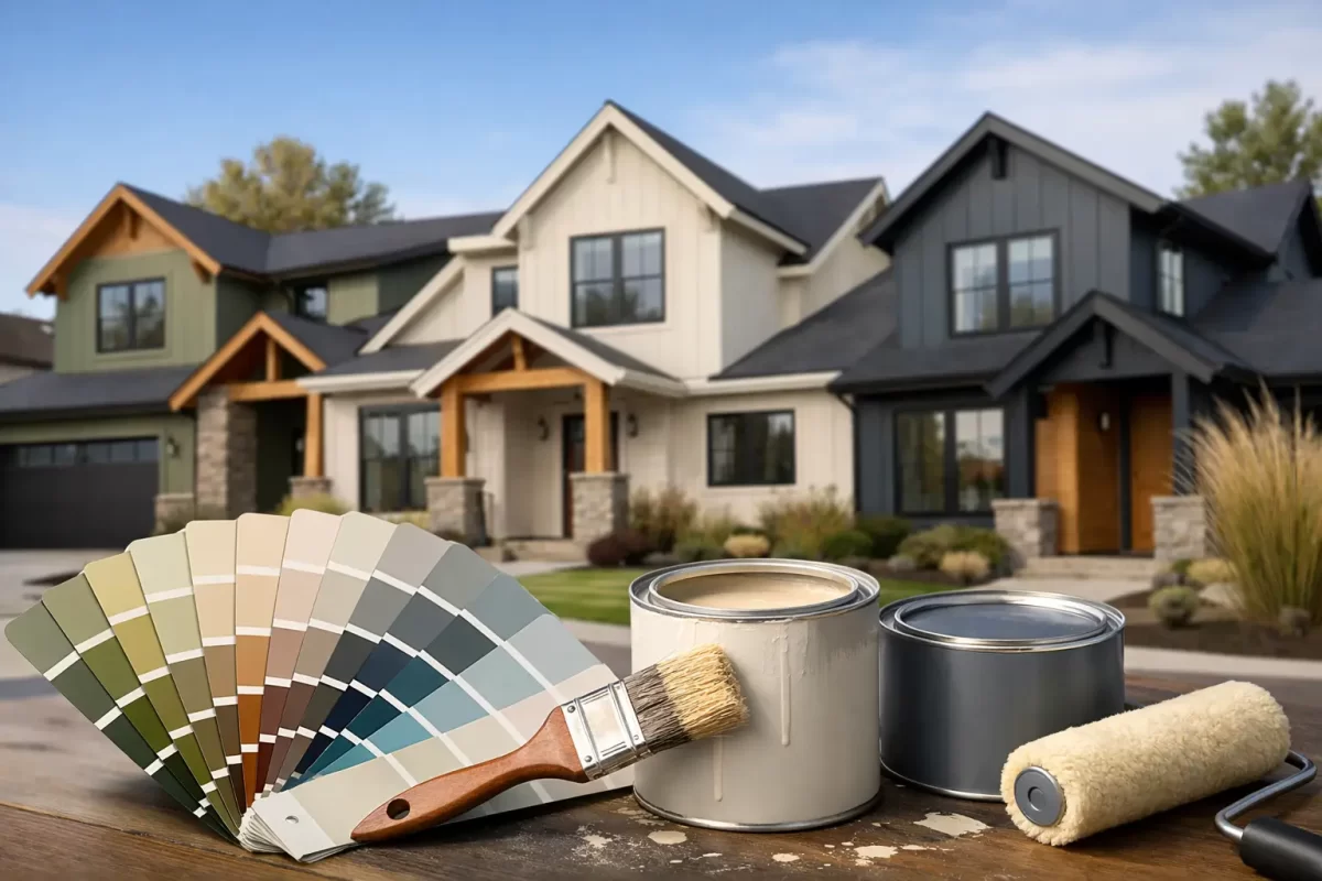
Street appeal can rise or fall on one decision – the exterior colour. And while exterior paint colour trends can be useful, the best result is never about copying the latest look without thinking about the home, the light and the setting around it.
For homeowners and property renovators, that matters more than ever. A colour that looks sharp on a new build in a display village can feel out of place on an older brick home. A shade that works beautifully in a cool southern climate can read too harshly under the stronger sun we get in coastal Queensland. Trends are a starting point, not the whole answer.
What exterior paint colour trends are shifting towards
The strongest move in exterior paint colour trends is away from stark, high-contrast schemes that can feel a bit rigid. In their place, we are seeing softer whites, warmer neutrals, natural greens and more grounded feature colours. Homes still look clean and modern, but less clinical.
That shift reflects how people want their homes to feel. Many owners are renovating for longevity rather than chasing a quick flip. They want a finish that looks current now but will still feel right in five or ten years. That tends to favour colours with a little warmth and depth rather than extremes.
It also suits the way many Australian homes sit within their surroundings. On the Gold Coast and in Tweed, for example, bright sun, greenery, coastal conditions and varied architectural styles all influence how colour performs visually. A paint chart under indoor lighting does not tell the full story.
Warm whites are replacing cold whites
White is still a major exterior choice, but the version of white is changing. Crisp blue-based whites can look sharp in some settings, yet they can also appear glaring outdoors. In full sun, they may bounce too much light and make trims or render feel flat.
That is why warm whites and off-whites are gaining ground. They still give a home a fresh, clean appearance, but they feel more settled and more expensive. They tend to work especially well on render, weatherboard and modernised brick exteriors.
The trade-off is that not every warm white suits every fixed surface. Roof colour, paving, stonework and guttering can all bring out yellow, grey or cream undertones. A white that looks balanced beside charcoal roofing may look muddy next to terracotta. This is where proper colour testing becomes more valuable than following trend photos.
Where warm whites work best
Warm whites are often a safe choice for full exterior repaints when owners want to modernise without making the house feel overdesigned. They also pair well with timber accents, black window frames and soft grey roofing. If the home has strong architectural lines, a warm white can keep the look clean without becoming too stark.
Earthy greens are moving from accent to main colour
Green has become one of the more interesting directions in exterior palettes. Not bright or overly decorative greens, but muted gum, olive, sage and deeper native-inspired tones. These colours sit comfortably in established suburbs and leafy streetscapes because they feel connected to the landscape rather than imposed on it.
They are also more flexible than many owners expect. A soft sage can freshen an older weatherboard home. A deep olive can add character to a front door, cladding section or fencing. Darker greens can create a strong, premium look on contemporary exteriors when balanced with lighter trims or natural textures.
The catch is that green carries undertones quickly. Some lean grey and sophisticated, others turn khaki or muddy if paired badly. On large areas, that difference becomes obvious. Testing samples on multiple sides of the house is the safest way to see how morning light, shade and afternoon sun change the colour.
Greige, taupe and stone are outlasting cooler greys
Cool grey had a long run, and it is not disappearing overnight. But many exteriors painted in icy grey now feel a bit dated, particularly when combined with bright white trims and black accents. The newer neutral palette is warmer and more natural.
Greige, taupe, mushroom and stone shades are becoming more popular because they soften the overall appearance of a home without making it feel beige or old-fashioned. They work well across brick, render and fibre cement, and they tend to sit more comfortably with landscaping, timber and natural stone.
These colours are also practical for owners who want broad buyer appeal. They are less polarising than darker statement colours and usually handle dust, weathering and day-to-day exposure better than very light finishes. That does not mean they are maintenance-free, but they can be forgiving visually.
Dark trims still have a place, but balance matters
Black and very dark charcoal trims remain popular, especially on modern homes. Used well, they can define windows, sharpen rooflines and give the exterior a premium finish. The problem is that dark contrast became so common that some homes now feel more trend-led than timeless.
Current colour schemes are using contrast with more restraint. Instead of pairing pure white walls with jet black trims everywhere, many owners are choosing softer wall colours and charcoal, bronze or deep olive accents. The result is still crisp, but less harsh.
This matters for practical reasons too. Very dark colours absorb more heat, and on certain surfaces that can affect performance over time. Product selection, surface preparation and the substrate itself all come into play. A good-looking colour choice still needs to be realistic for the material being painted.
The smarter way to use dark colours
Dark colours often work best as a feature rather than the whole story. Front doors, garage doors, shutters, fencing and selected trims can all carry depth without overwhelming the home. On larger walls, especially in full sun, the wrong dark tone can feel heavy fast.
Natural finishes and mixed materials are influencing colour choices
One reason exterior paint colour trends are becoming softer is the rise of mixed-material facades. Painted render now often sits alongside timber, stone, brick or metal elements. That means the paint colour has to do more than look good on its own – it has to connect the whole exterior.
This is why earthy neutrals and muted colours are doing so well. They allow feature materials to stand out without clashing. A painted exterior should not fight the roof, driveway, retaining walls or surrounding garden. It should pull them together.
For renovators, this is especially important. If you are not replacing every fixed element, the paint scheme needs to work with what stays. Choosing a trend colour without considering existing brick, tiles or paving is where many repaint projects lose cohesion.
How to choose a trend that will still look right in a few years
A good exterior colour scheme should feel current, but not temporary. The easiest way to achieve that is to separate trend from foundation. Use the more timeless shades on the largest areas of the home, then bring in trend through accents and details.
That might mean using a dependable warm white, greige or stone tone across the main facade, then introducing a current green or deep charcoal on the front door, feature cladding or trim. If tastes change later, those smaller elements are easier to update.
It also helps to be honest about the style of the home. Not every house needs to look ultra-modern. A Queenslander, a coastal home, a brick renovation and a commercial frontage all respond differently to colour. The best outcomes come from working with the building rather than forcing it into a trend category.
Why sample testing matters more outside than inside
Exterior paint behaves differently because the environment is doing half the work. Sunlight intensity, shade, reflections from neighbouring surfaces and even surrounding greenery can all shift how a colour reads. A colour card or small sample pot viewed in isolation is not enough.
Large painted test patches on different sides of the property give a much clearer picture. What looks like a soft neutral at 9 am can appear far darker by late afternoon. What seems like a calm grey may reveal a strong purple or green undertone once it is up on the wall.
This is one area where experienced guidance saves time and money. Jag Painting Solutions often helps clients narrow colour choices down to what will actually suit the property, not just what is popular on paper. That kind of advice can prevent expensive second-guessing once the project is underway.
The trend that matters most is suitability
The most reliable exterior colour choices are not always the boldest or the newest. They are the ones that suit the architecture, handle local conditions and still look right after the excitement of the repaint has settled.
If you are planning an exterior update, treat trends as useful direction rather than a rulebook. A well-chosen colour scheme should improve the look of the property, respect its style and give you confidence every time you pull into the driveway. That is what makes a repaint feel worth doing.


