

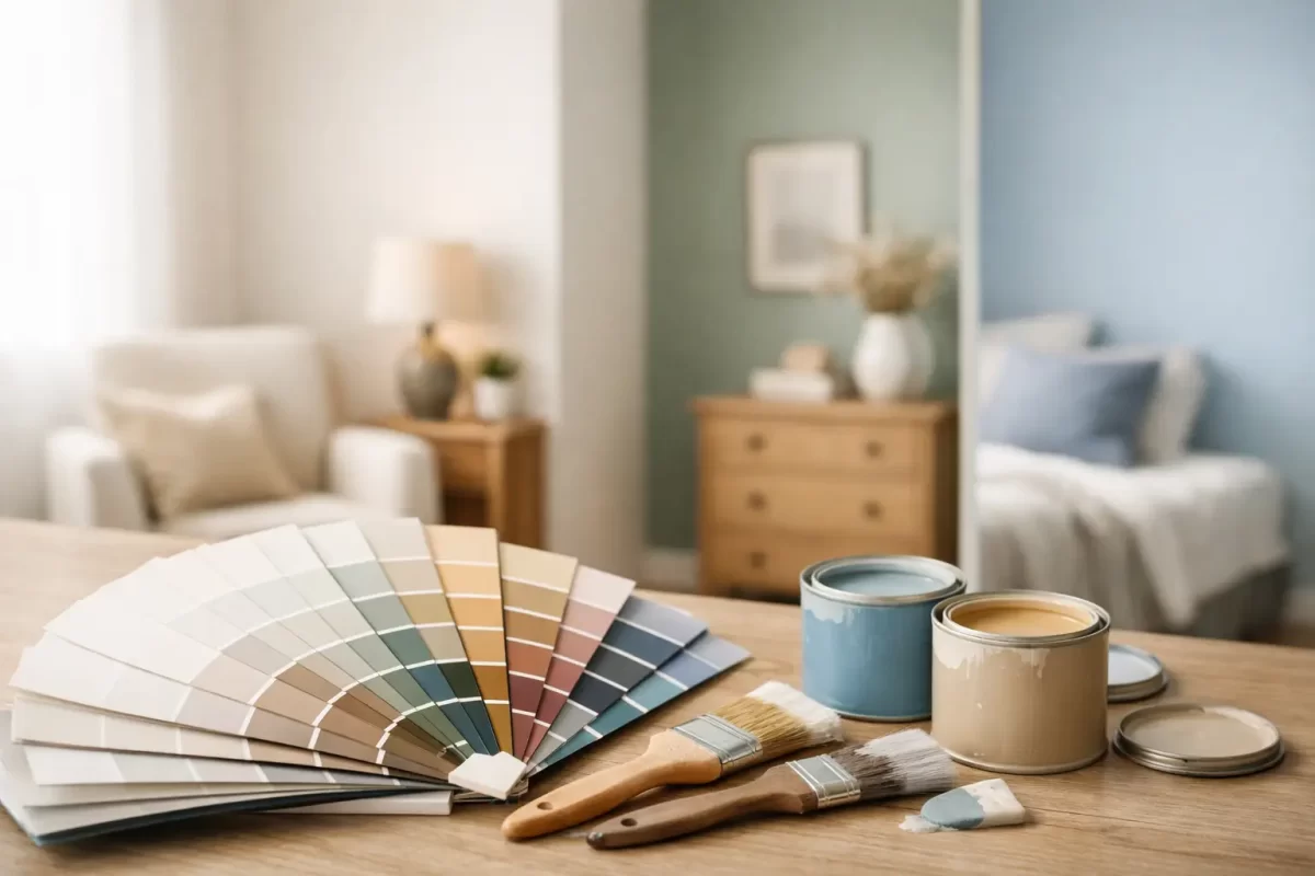
A small room can feel cramped for reasons that have nothing to do with floor area. Low natural light, heavy colour choices, patchy plaster, and the wrong finish can all make a compact space feel tighter than it is. That is why choosing the best paint colours for small rooms is less about following a trend and more about understanding how light, undertone and surface quality work together.
For most homes, the goal is not to make a small room look stark or washed out. It is to make it feel open, balanced and comfortable to spend time in. The best result usually comes from colours that reflect light well, sit calmly on the walls, and suit the room’s orientation, flooring and furnishings.
What actually makes a small room feel bigger?
Paint cannot change the room’s size, but it can change the way the eye reads the space. Lighter colours tend to bounce more light around the room, which softens shadow lines and helps walls feel less close in. Mid-tones can also work well when they are warm or muted enough to avoid creating visual heaviness.
Contrast plays a big part too. If the walls, trims and ceiling are all sharply different, the edges of the room stand out more. In some spaces that is a good design choice, but in small rooms it can emphasise every boundary. Keeping the palette close in tone often creates a gentler, more spacious feel.
Surface condition matters as much as colour. Uneven walls, dents and poor patching show up more under certain paints, especially when light hits them side-on. A well-prepared surface gives soft colours a cleaner, more expansive look.
Best paint colours for small rooms by colour family
There is no single best shade for every home, but some colour families are consistently reliable in smaller spaces.
Soft whites
Soft whites are a common choice for good reason. They reflect light, feel fresh and suit almost any interior style. The key is choosing a white with the right undertone. A bright, cool white can feel crisp in a well-lit room, but in a darker space it may come across as flat or clinical. A softer white with a warm or neutral base usually feels more comfortable and forgiving.
This is often the safest option for hallways, smaller bedrooms, laundries and compact living areas where you want the room to feel clean and open without being harsh.
Warm neutrals
Warm neutrals such as light greige, soft beige and muted stone colours can be excellent in small rooms. They add more depth than white, but still keep the room airy. They also tend to work well with timber flooring, natural fibres and warmer lighting.
If a room gets limited daylight, warm neutrals can stop it from feeling cold. That said, too much brown or yellow in the undertone can make the space look dated, so balance is important.
Pale grey-greens and sage tones
For homeowners who want a bit more personality, pale grey-greens and soft sage shades can work beautifully. These colours feel calm and easy on the eye, and they can make a room feel settled rather than boxed in. In bedrooms, studies and powder rooms, they often create a more considered finish than plain white.
The trade-off is that green-based shades are more sensitive to lighting changes. What looks soft and subtle during the day can appear dull in the evening if the room has poor artificial lighting.
Light blue-greys
Light blue-greys can make small rooms feel fresh and relaxed, especially in coastal-style homes or bathrooms. Used carefully, they bring a sense of airiness without overpowering the room. In the Gold Coast climate, these cooler tones can feel particularly comfortable in homes that get strong sun for part of the day.
The risk is choosing a shade that turns too cold. In south-facing rooms or darker corners, that can leave the space feeling less inviting.
When darker colours can still work
Not every small room needs to be painted light. In some cases, a deeper shade can make a room feel more intentional and less awkward. This tends to work best in powder rooms, media rooms, guest bedrooms or studies where a cosy feel is part of the brief.
The trick is to commit to the look rather than fighting it. A charcoal-green, deep blue-grey or warm moody neutral can make the walls visually recede when paired with the right lighting and trim treatment. If the room has strong architectural features, darker colours can also add character.
Still, darker paint is less forgiving. It shows plaster imperfections more readily, can absorb light quickly, and needs careful preparation to achieve an even finish. If the aim is to make a room feel larger rather than dramatic, lighter colours are usually the better choice.
The role of natural light and room direction
A colour card never tells the full story. The same paint can look completely different from one room to the next.
North-facing rooms usually handle cooler whites and greys better because they receive steadier natural light. South-facing rooms often benefit from warmer tones that stop the space feeling dull. East-facing rooms can look bright and fresh in the morning, then flatter and cooler later on. West-facing rooms tend to pick up warmer afternoon light, which can intensify creamy or beige undertones.
That is why sample testing matters. Paint a decent-sized section on more than one wall and look at it across the day. A colour that looks right at 10 am might not feel right by evening under warm interior lighting.
Don’t overlook ceiling, trim and finish
Choosing the best paint colours for small rooms is not just about the walls. The ceiling colour, trim colour and paint finish all affect how spacious the room feels.
A lighter ceiling generally helps lift the room. In most homes, keeping the ceiling white or close to white makes sense, particularly where ceiling height is limited. Painting the ceiling and walls in similar tones can also soften the room’s edges.
Trim is more flexible than many people think. Crisp white trim can look neat and classic, but high contrast can make a small room feel more segmented. Using a trim colour closer to the wall colour often creates a smoother, less interrupted look.
Finish matters for practical reasons as well as appearance. Flat or low-sheen paints usually minimise surface imperfections on walls, while semi-gloss or gloss finishes reflect more light but show more flaws. In a small room with less-than-perfect walls, a softer finish is often the smarter choice.
Common mistakes in small rooms
One of the most common mistakes is assuming pure white is always best. It can work, but it is not automatic. In the wrong setting, it can make the room feel cold and unfinished.
Another mistake is choosing paint before considering flooring, cabinetry, tiles and furniture. Small rooms do not have much space to absorb clashing undertones. If the walls lean pink and the flooring leans yellow or grey, the mismatch is usually obvious.
People also underestimate the impact of poor preparation. Cracks, sanding marks and uneven patching can ruin the effect of even the best colour choice. In compact rooms, where walls are close and often viewed from multiple angles, finish quality matters even more.
How to choose the right colour with confidence
Start with the room’s purpose. A small bedroom should feel restful. A home office may need a bit more definition. A bathroom often benefits from cleaner, fresher tones. Once you know how you want the room to feel, narrow your options to two or three colour families.
Next, assess the light honestly. Do not rely on how the room looks on a bright day alone. Consider evening use, lamp light and shadowed corners. Then test your samples on the walls, not just on a loose card.
Finally, think beyond colour charts. The right paint colour can only do its job if the surfaces are sound and the finish is applied properly. That is often where professional advice helps most – not just in choosing a nice shade, but in making sure the final result feels polished and consistent.
For homeowners planning an update, a good painter should be able to guide colour selection, explain what will suit the room, and prepare the surfaces properly before the first coat goes on. That combination makes a real difference in smaller spaces, where every detail is easier to notice.
A small room does not need tricks or trendy colours to work well. It needs a paint choice that suits the light, respects the scale of the room, and is finished with care. Get that right, and even the most compact space can feel settled, brighter and far more usable.


